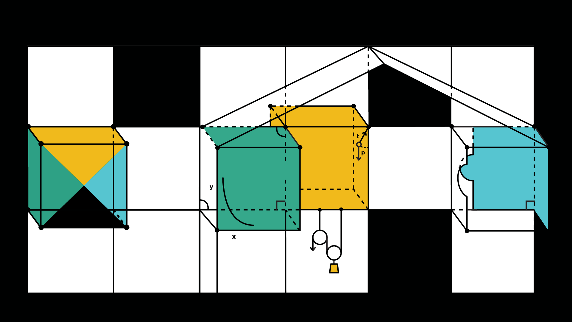
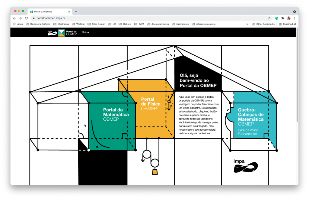
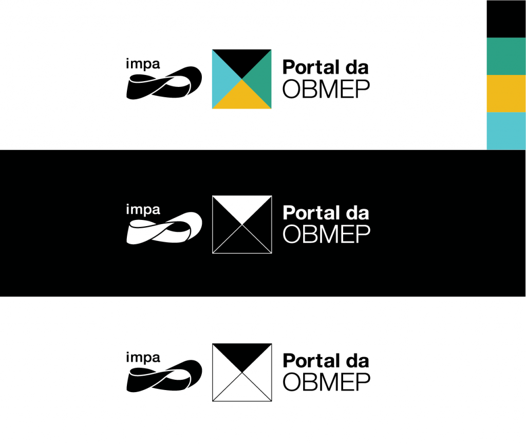
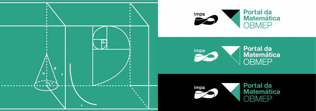
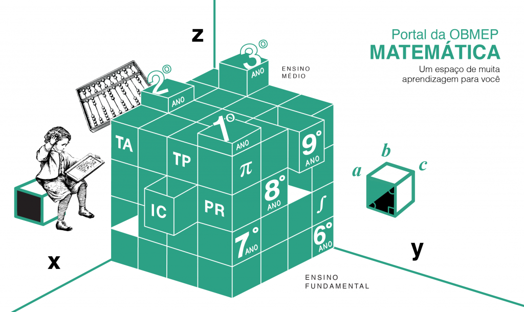
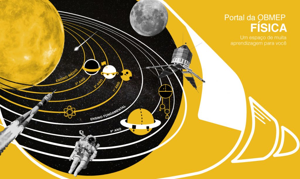
I was responsible for the visual proposal of the OBMEP Portal, a virtual space for elementary and high school students to access video classes content. The idea was to visually refer to a house formed by these three portals and, later on, the Portuguese portal will enter. Each one predominates a color of the portal’s brand, which is a paper divided into four parts and opens up a universe of elements that refer to the themes of each one.
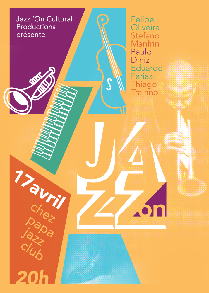
Jazz’On presents characteristics such as contemporaneity, movement and transparency. The project was inspired by the atmosphere of nightclubs and jam sessions where musicians were invited to go up on stage and play with the band without any previous rehearsals. The encounters brought a mixture of unusual styles and combinations.
The main goal of the visual identity of Jazz ‘On is presented features such as contemporaneity, movement, and transparency. The project was inspired by the atmosphere of nightclubs and jam sessions. Jam means to play without a song in mind and a lot of bands use this resource to stimulate creativity and figure out new records. In these meetings, the musicians were invited to go up the stage and play with the band without any previous rehearsals. The producer Jazz’ On makes festivals, shows and albums in French and Brazil.
Creative Process
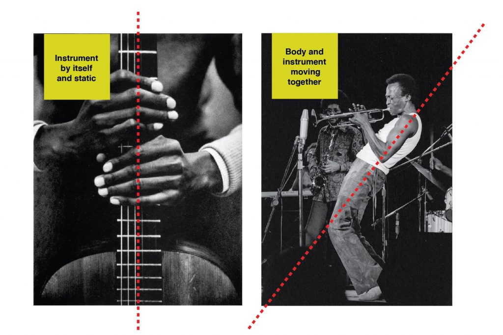
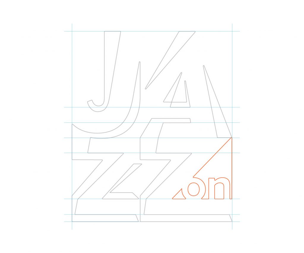
After a few jam sessions, I noticed some standards, organized words that guide me in the graphic project: movement, asymmetry, vibration, light, flexibility, performance, improvisation, and transparency. This combination between the musician and the instrument results in new involuntary impulses and movements that give life to the meetings which generate a unique moment that probably could not be reproduced in a recording of a disc. In the visual aspect, I worked with the word counterpoint that in the music universe is a composition technique that combines two or more distinct melodies performed simultaneously by instruments or voices. However, the work also means também harmonious or complementary contrast. In this case, the contrast worked was leaning the body with energy and movement as illustrated in the image below.
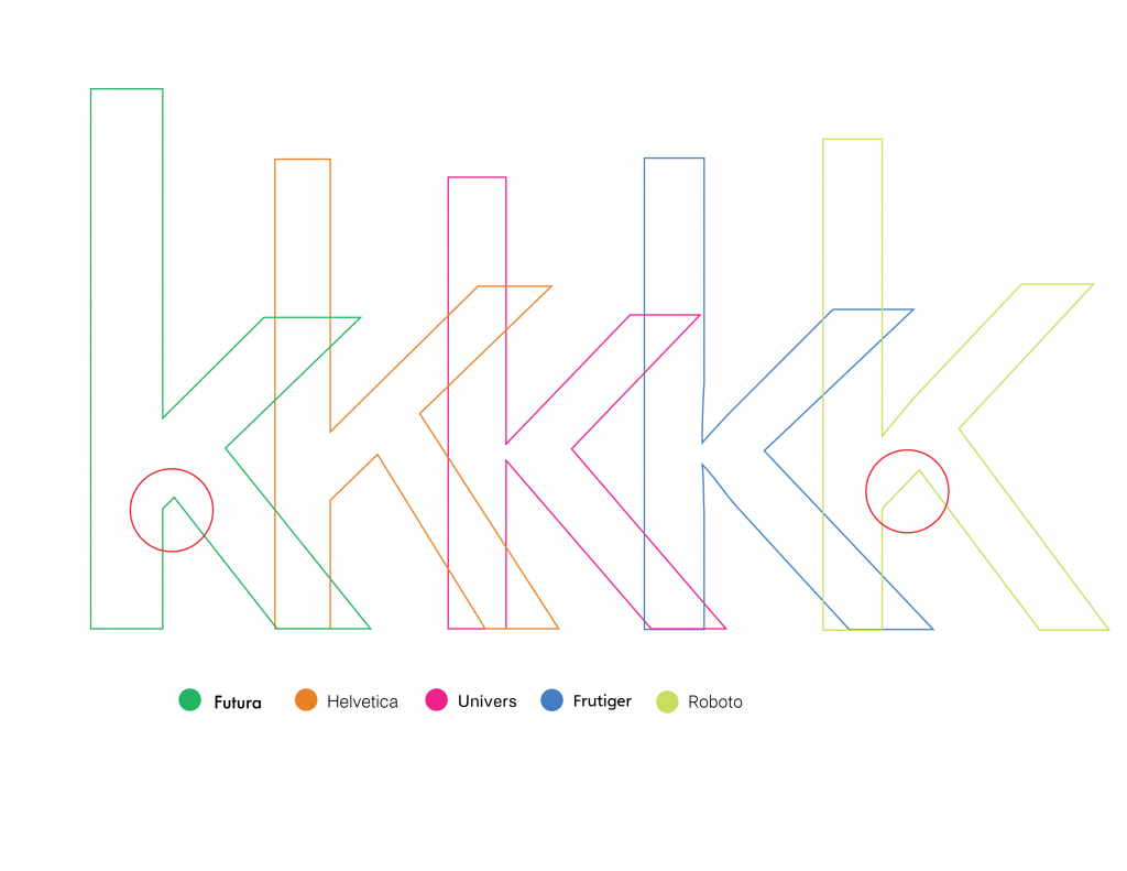
The type of project was Avenir developed by Adrian Frutiger in the 1920s. The French word avenir means the future. Jam session songs are creations of an unexpected and fluid future without planning. As a family inspired by the geometric style, the contrast between static and movement could be sharpened.
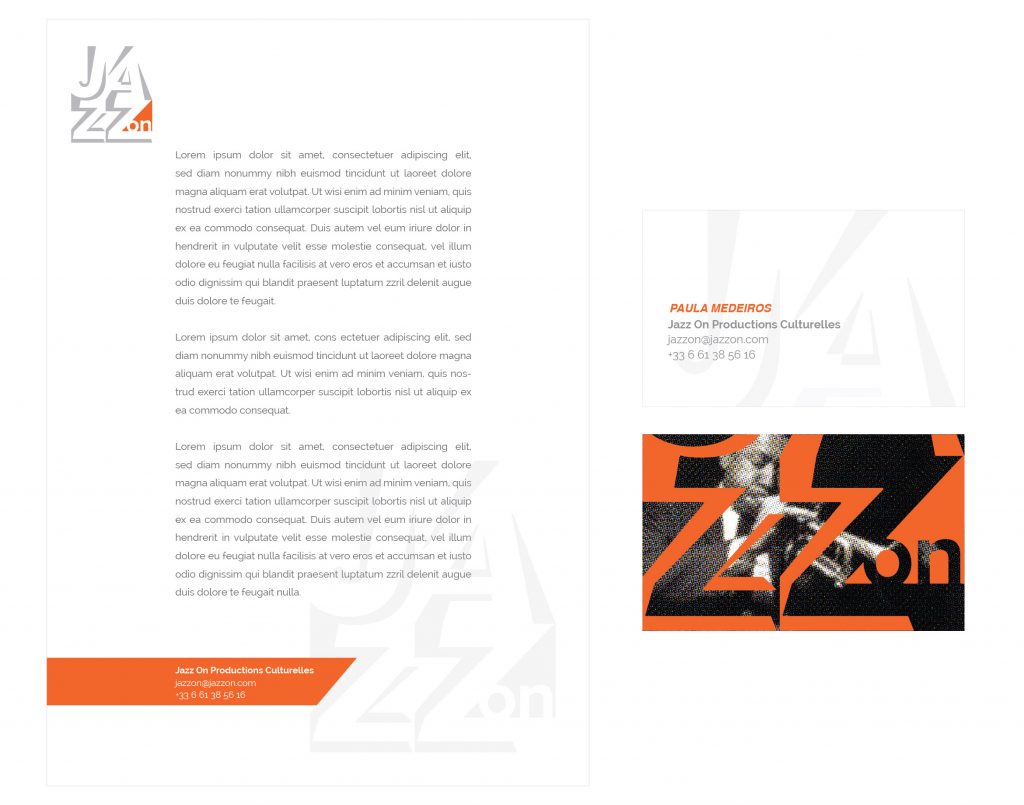
The design of the brand was based on the light beams of the stages and the mixture between the regular and italic style of the typography. Being cast, she can adapt to different backgrounds and images as well as in jazz where improvisation is a feature present.
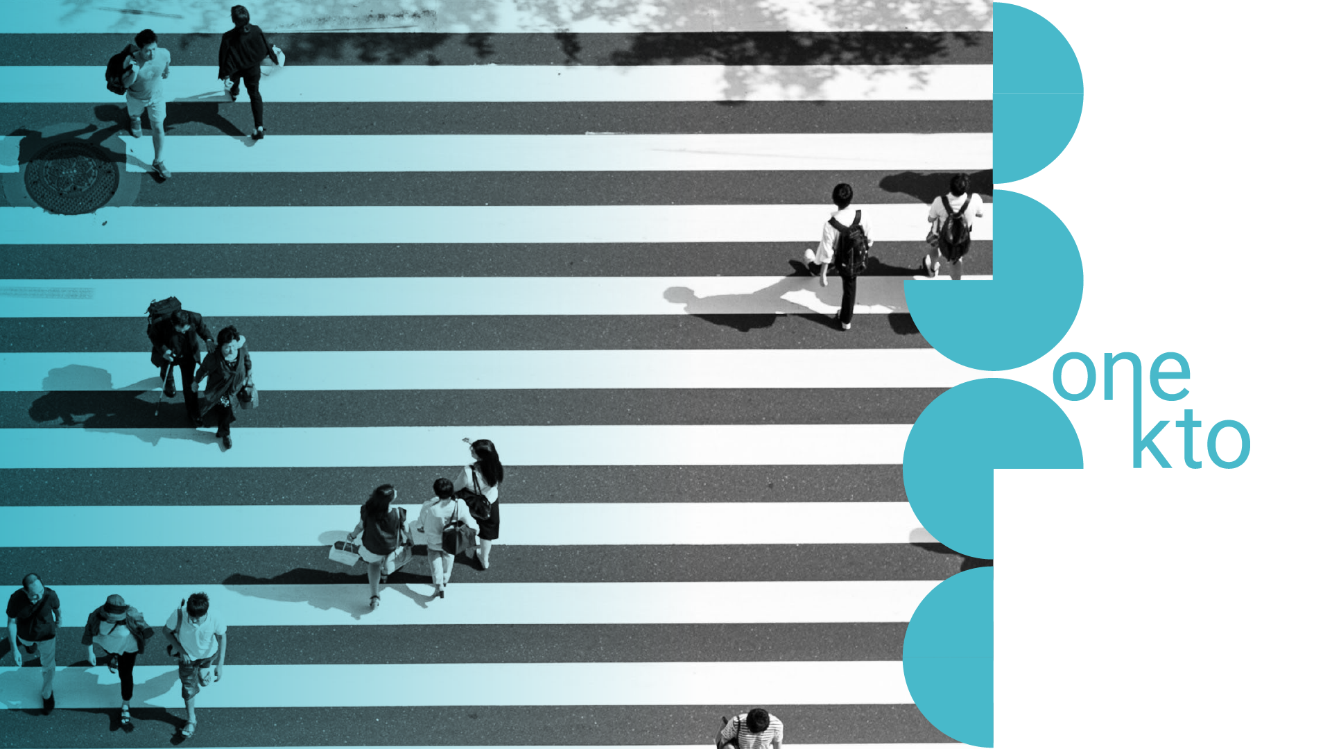
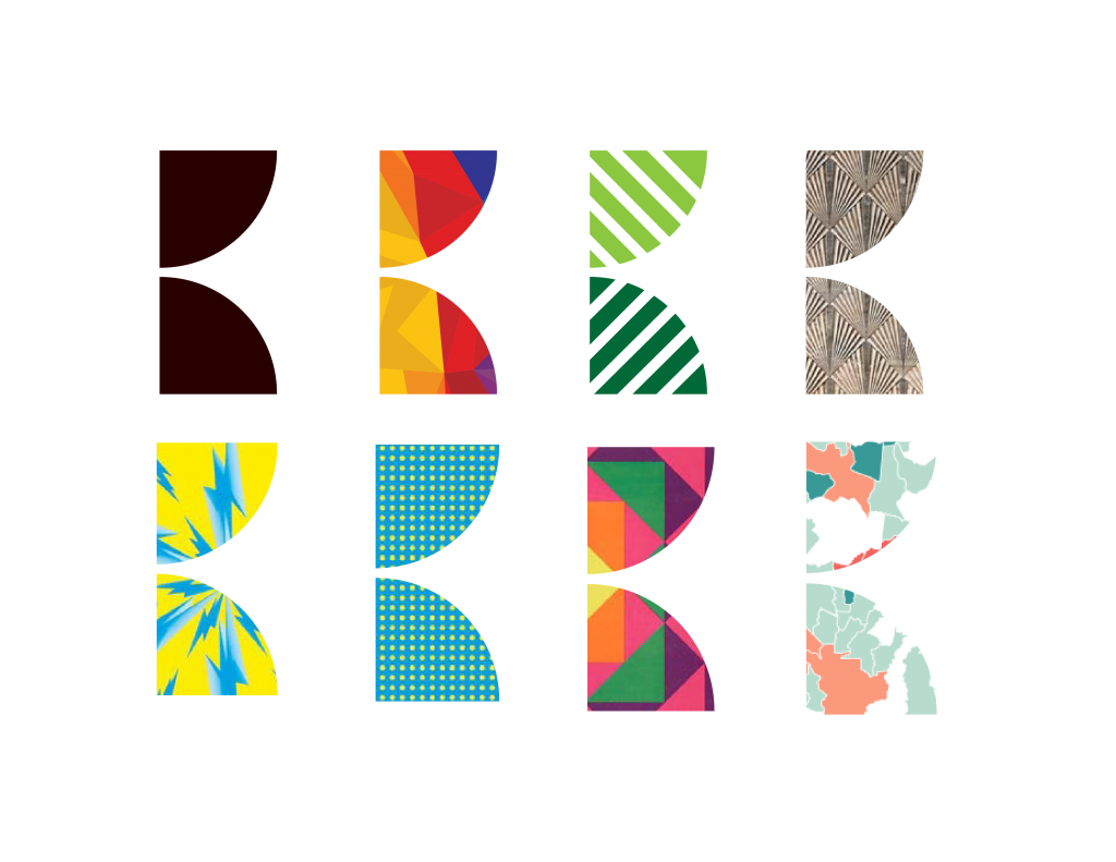
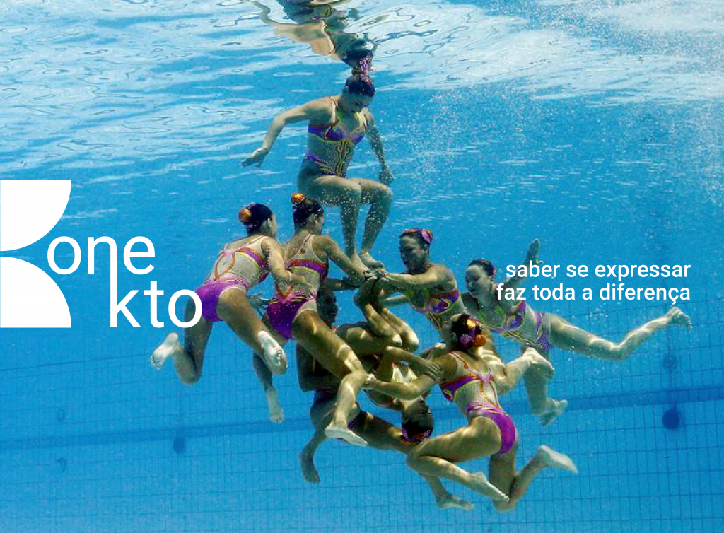
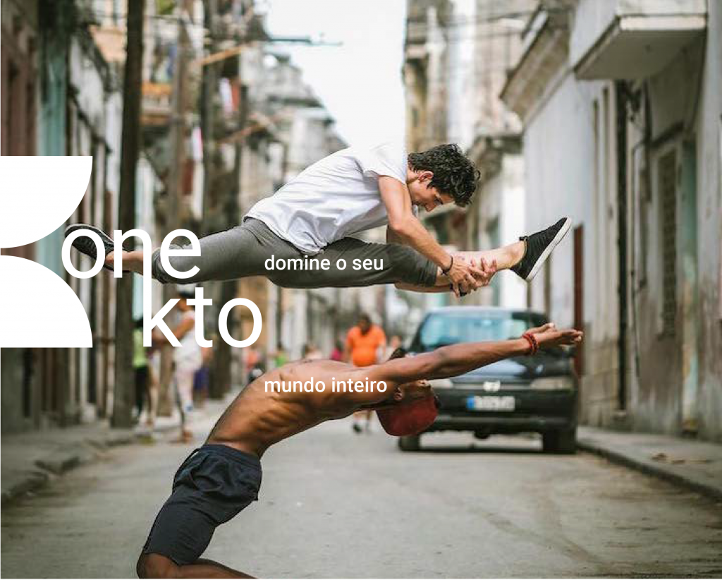
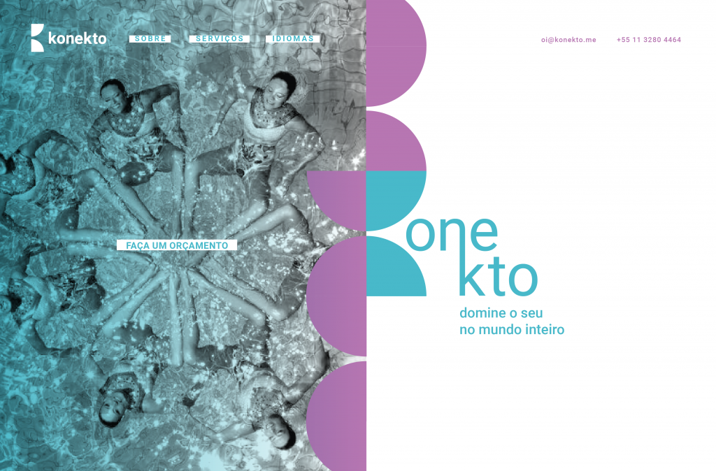
Konekto means connection in Esperanto, a language created with the aim of bringing people and cultures around the world together and whose words can be spoken by everyone, regardless of their origin. Its values come from this thought of connecting companies, people and countries, facilitating communication and understanding between different peoples, languages , and cultures. Konekto is a translator who focuses on audiovisual (subtitle translation) but also different types of translation. I developed a brand in which the letter K is the sum of two-quarters of a circle that comes from the shape of the world and can have different positions and fittings. The brand has a hybrid feature, in which different textures can and should be used, such as its filling. The visual identity aims to show that communication can be diverse and come from other meanings that are not limited to speech and writing.
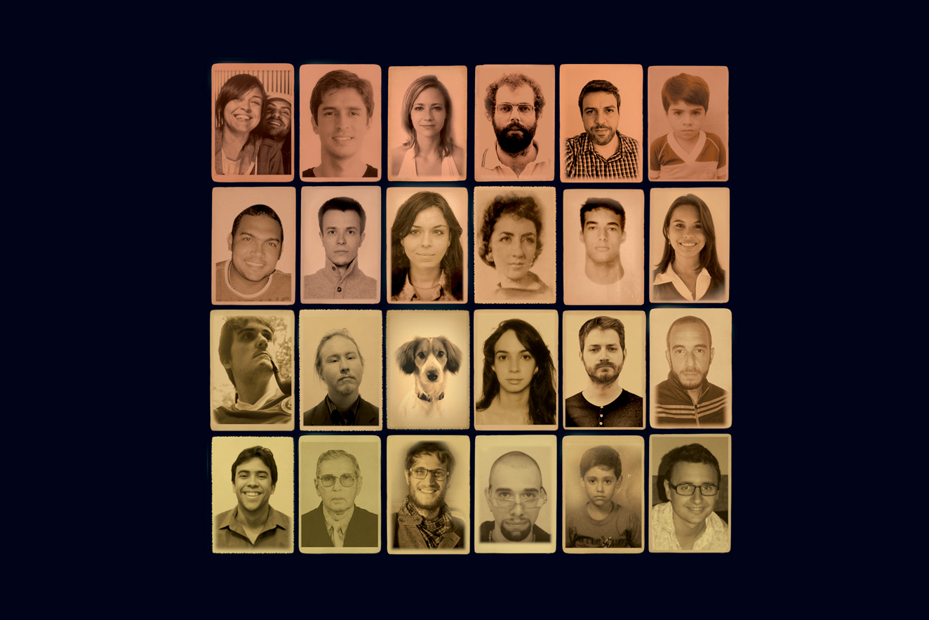
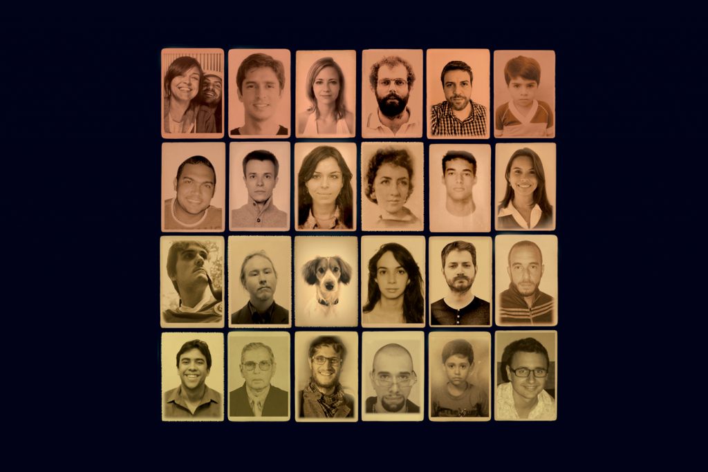
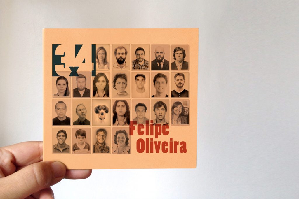
The project of the Retrato 3×4 album consists of the union of music and the multiple experiences throughout the period of the formation of Felipe Oliveira. Gathering the portraits of people who were important during their trajectory was a tribute to thank everyone.
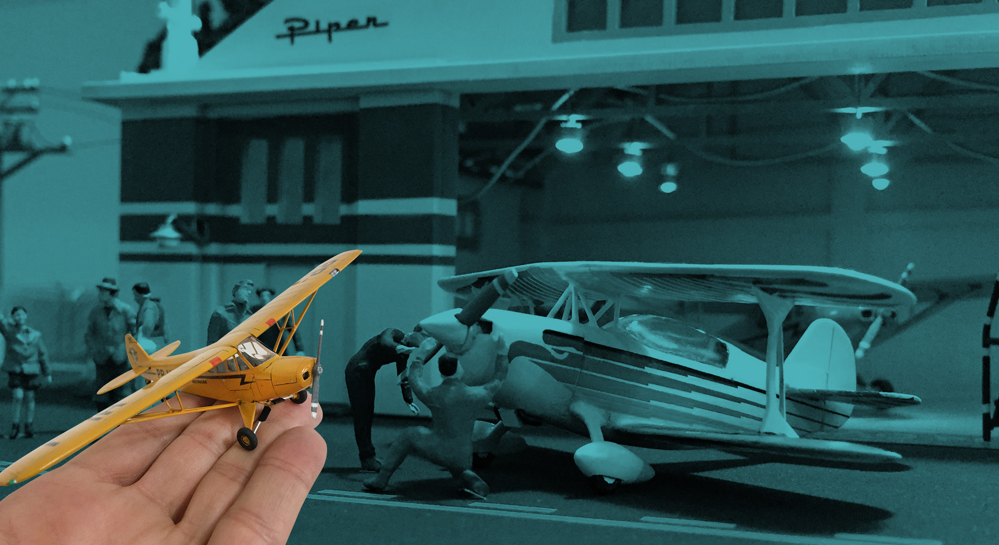
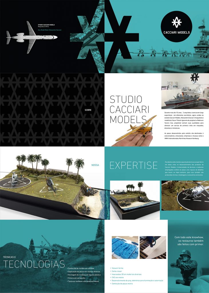
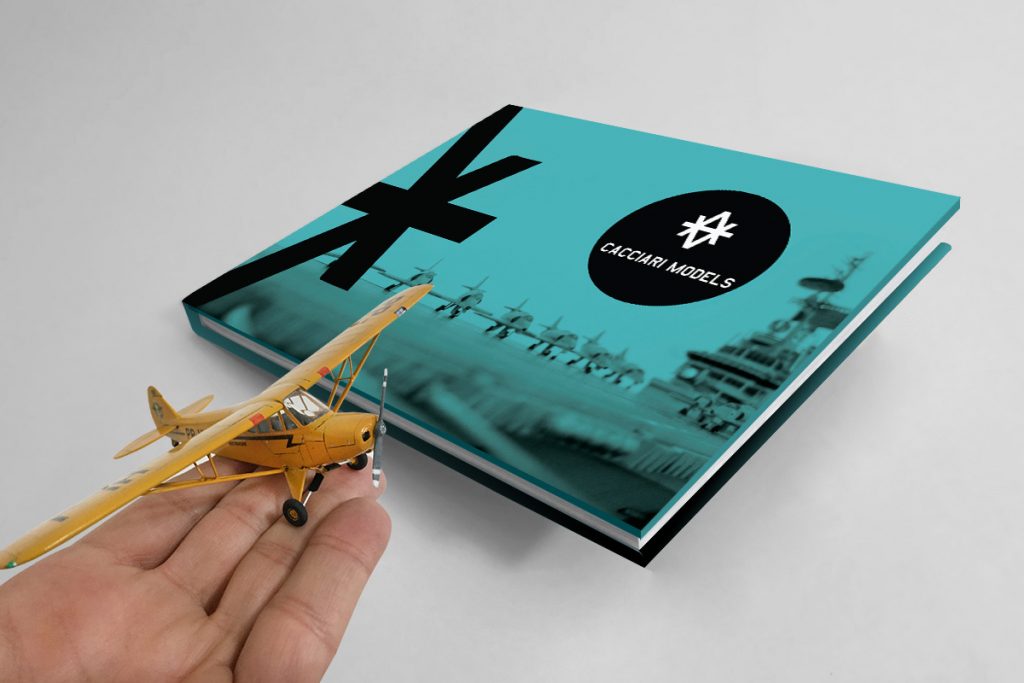
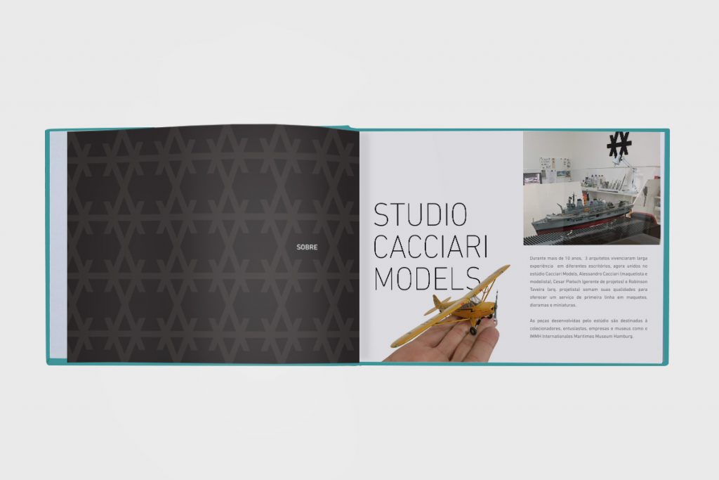
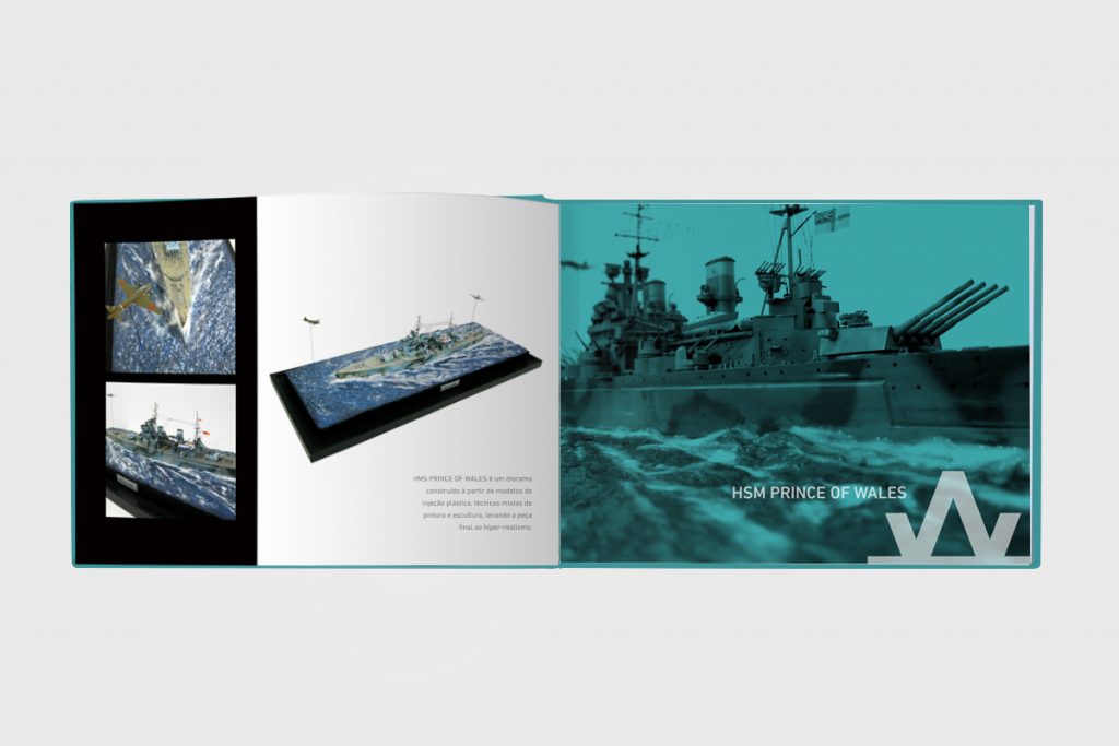
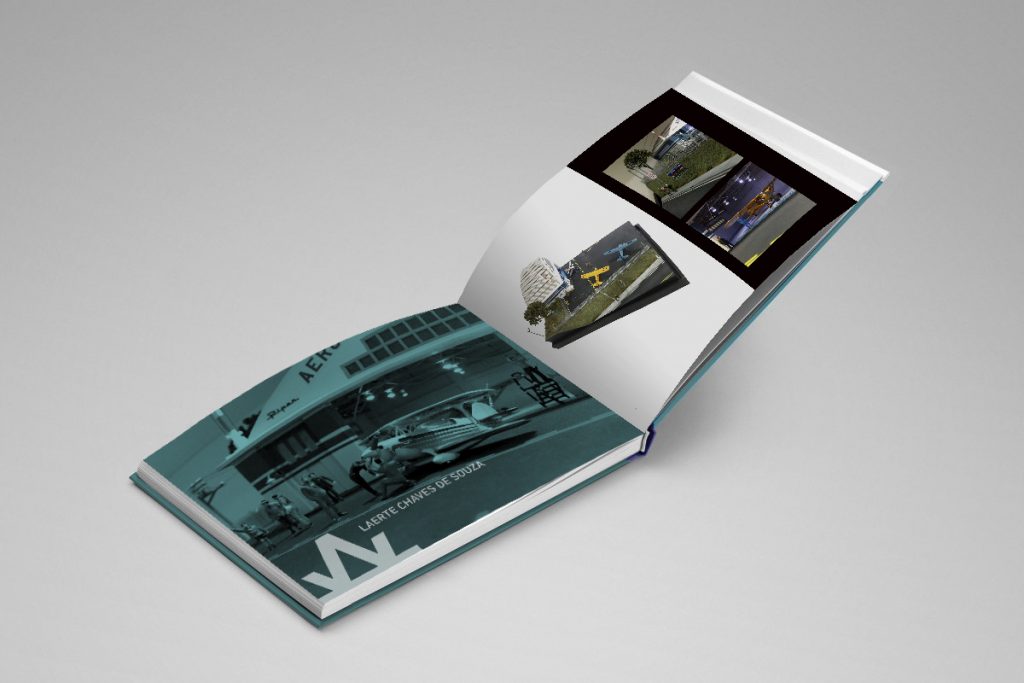
Cacciari Models is a studio that develops miniature projects for the most varied sectors. I created the visual identity project and commercial material. The main idea is to create immersion in the world of scenarios in a reality full of expression. The elaborate technique and details are features that was highlighted in graphic design.
After finishing the UX Design course at Mergo (July/2018 – São Paulo), the professor Edu Agni offered an opportunity to advise students that wished to conduct a project on their own.
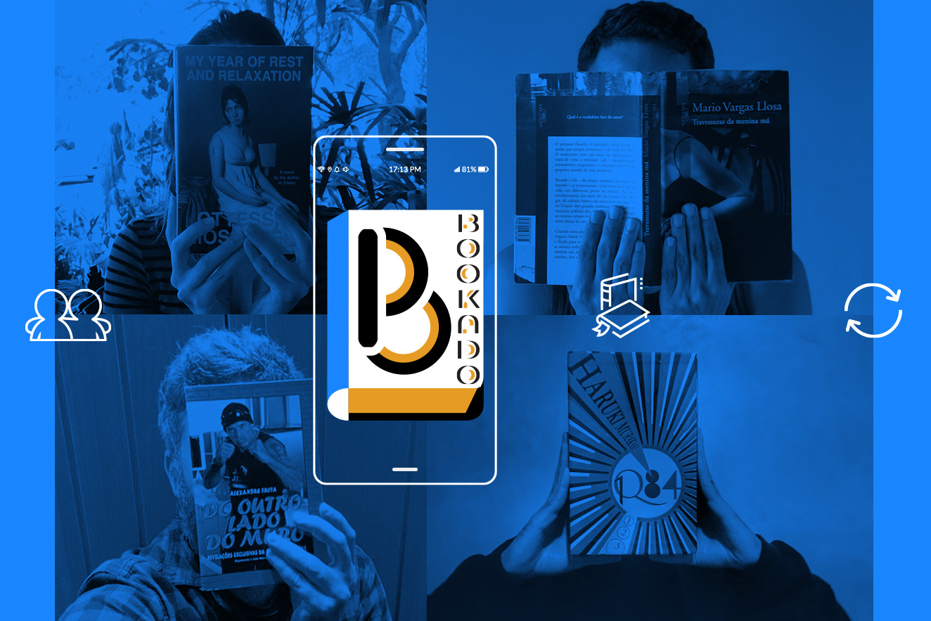
Challenge How to create a new social experience of exchanging used books through technology?
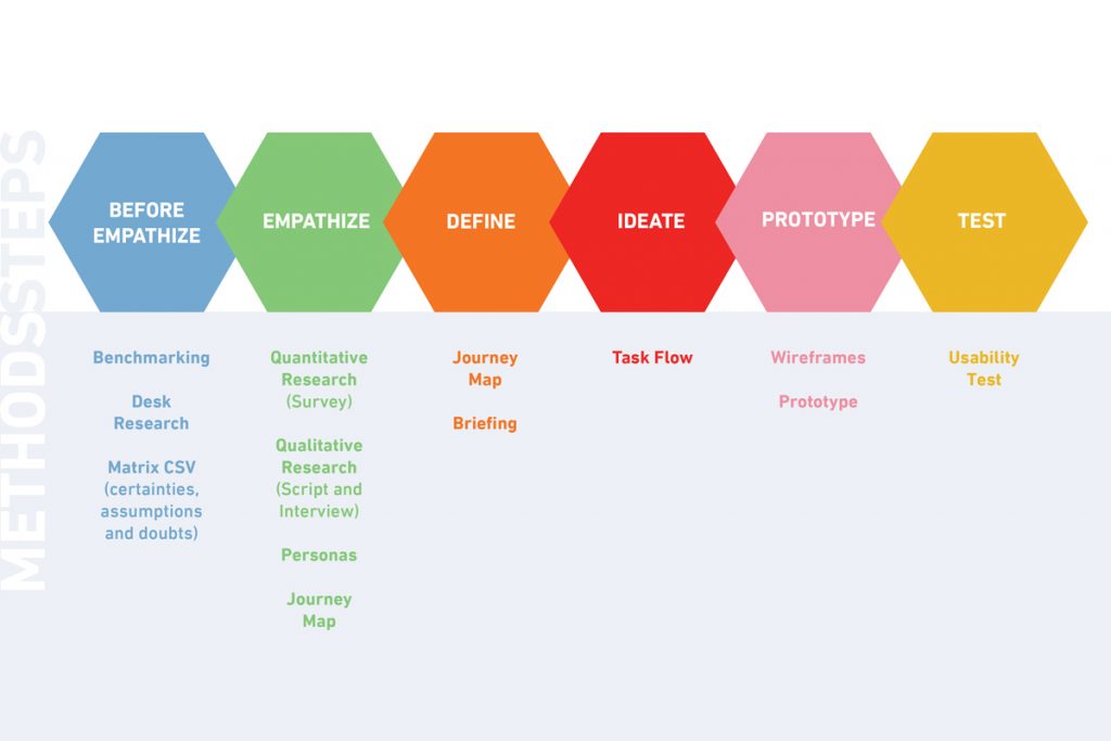
Process Conducted Pre-Empathy > Empathy > Define > Ideate > Prototype > Test
1) Pre-Empathy
Research in news sites and blogs to understand book sharing and what business are already working on that. After this step, a CSD matrix was done to organize the main points of the project.
2) Empathy
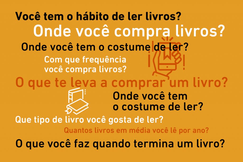
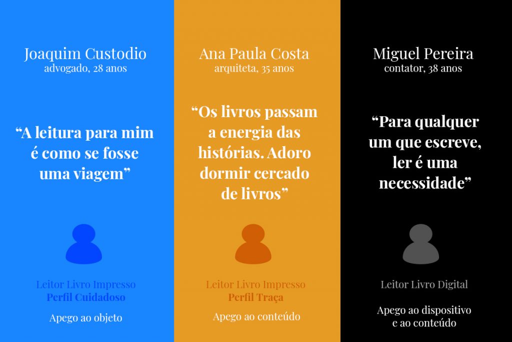
Making of a Google form to understand the reading, buying and exchange habits of readers. The answers allowed for the creation of three different reader profiles: the Careful Reader, the one that values and cares for their books; the Moth Reader, the one that is interested only in the content, with no attachment to the physical book; and finally the Digital Reader, the one that reads mainly e-books in mobile devices.
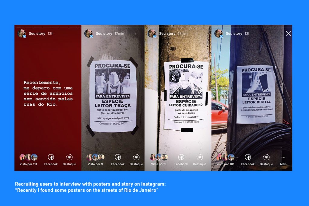
I created a semi-structured interview to understand reading habits, what the reader does to the books when they´re finished, if they use book exchange social media or if they´ve ever exchanged books. I found it difficult to arrange candidates for the interviews in a short time. To solve this issue, I made “Wanted” posters, attached them to street posts in Rio de Janeiro and took photos. I posted the photos on Instagram as if I had found the posters curious and did not know exactly what they meant. I got the return I was looking for, as many people were interested and reached out to schedule their interviews. Seventeen readers that fit on of the three profiles were interviewed.
The personas were based in the characteristics of each profile focusing in the following aspects: interests and motivations, daily tasks, frustrations, background, and main tasks and goals.
After defining the personas, I followed with the user journey to identify the contact points and opportunities within the experience of buying, reading and exchanging books.
3) Define
Problem: readers (of printed and digital books) feel the need to share the reading experience with others, but have difficulty finding people with the same tastes and affinities in the literary universe.
Goals: Promote the interaction and exchange of books between readers in an accessible and economical way through technology.
Target Audience: People that view reading as a moment of pleasure. This public enjoys exchanging books and recommendations. They wish to interact more with other readers.
The solution to this problem was an app that allowed exchanging books. Its main functions are: creation of a profile with a profile photo (the app suggests that the user post a photo with their favorite book), a library with current readings and a history of read books, finding other readers (social media), the exchange of books, and the wall of the reader (a news feed with the main events in the literary universe). Furthermore, the app presents a virtual currency called Bookado. With each exchange, the user receives Bookados that may be traded for discount coupons in bookstores and sites.
4) Ideate
In this step, I elaborated a task-flow focusing on the exchange of books inside the app with the goal of creating a more efficient way for the user to exchange books with another reader. The flow was designed starting from the app sign-up all the way to the exchange confirmation along with the Bookado credits;
5) Prototype
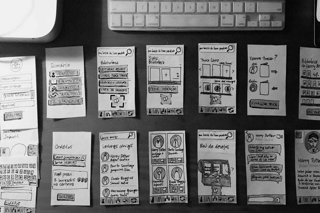
The drawings of the screens were done on paper. At first, I inserted colors, but afterwards, I realized they were a distraction in the usability test. At this moment, the main goal was to focus on the flow and functionality to understand if the app allowed the used to easily perform the exchange. The paper screens were photographed and the navigation flow for the test was created.
6) Test
I asked five readers and social media users to take the usability test. I gave them three tasks: sign-up, exchange a book, and use the exchange credits (bookados). Of the five users, four were able to finish all of the tasks and said they would use the app.
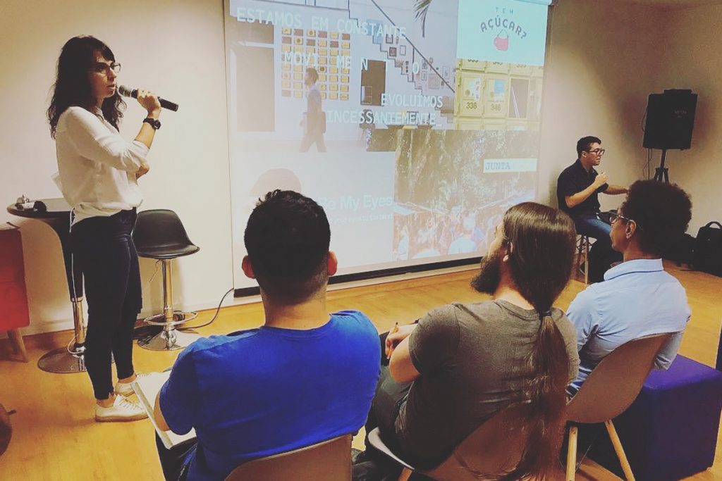
After the test, I presented the project at Mergo for a group of UX Design specialists to receive feedback and understand what could be done to perfect the app.
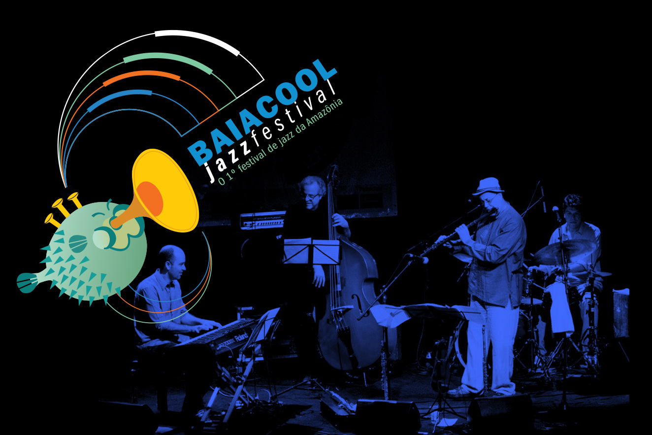
They have passed through the stages of Baiacool Jazz names like Hermeto Pascoal, Leo Gandelman, Marcio Montarroyos, Carlos Malta, Kiko Loreiro, Elephant Foot, Toninho Horta, Mark Lambert, Nika Stuart, Boca Livre, Tom ati, JJ Jackson, Jeff Gardner etc., as well as great names in instrumental music such as Careca Braga, Adelbert Carneiro, Magrus Borges, Delcley Machado, Alcyr Meirelles, Nêgo Nelson, Sebastião Tapajós, Bob Freitas, Trio Manari, MG Caliber, Rafael Lima, Amazon Jazz Band and Minni Paulo Medeiros, the great mentor of the project.
Minni Paulo’s first step towards the Baiacool was in the ’80s, with his band Marginal Society, the first instrumental band from Pará.
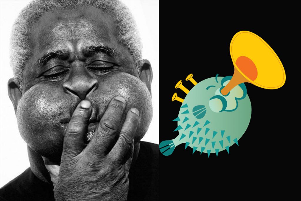
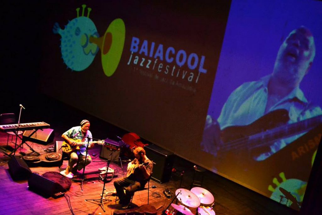
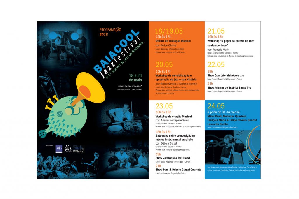
I developed the project to revitalize the brand and presented a new visual identity for the festival that took place in May 2015.