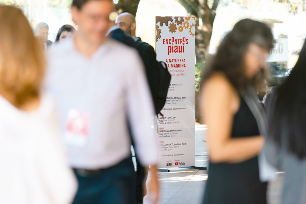
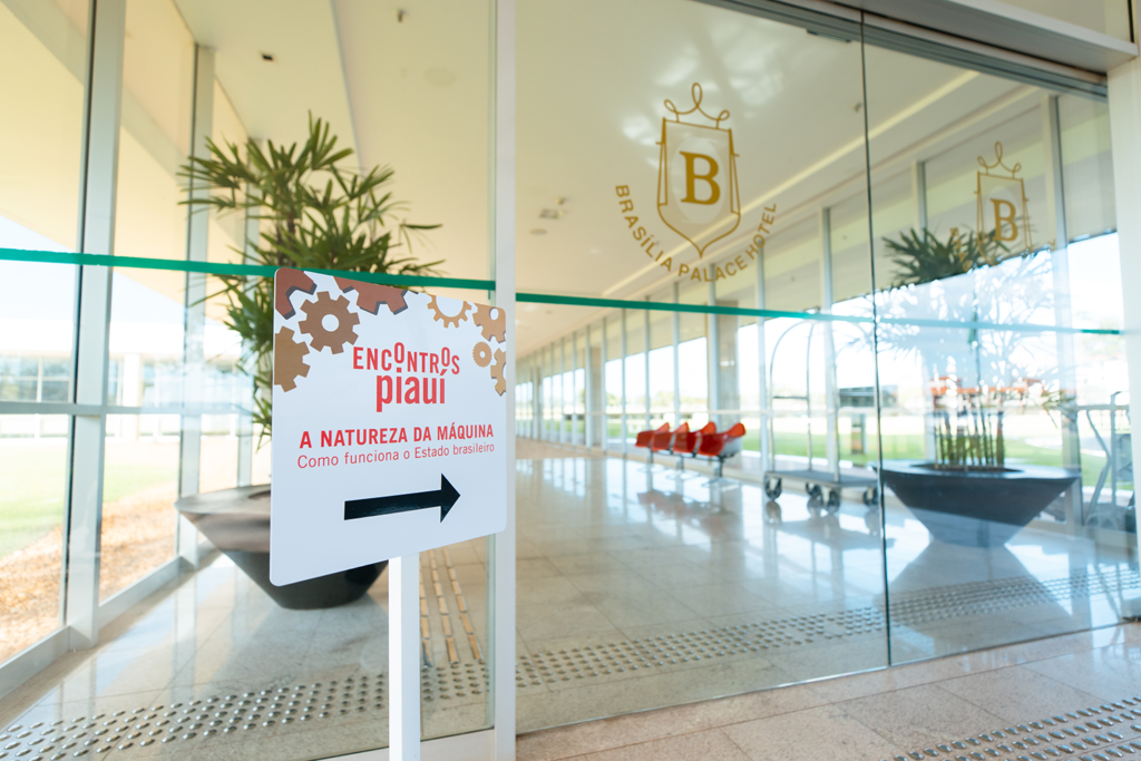
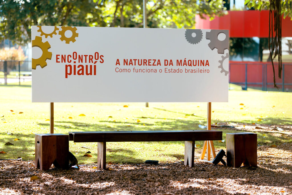
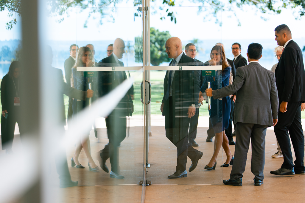
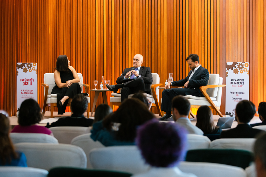
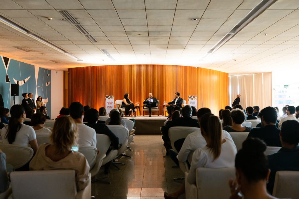
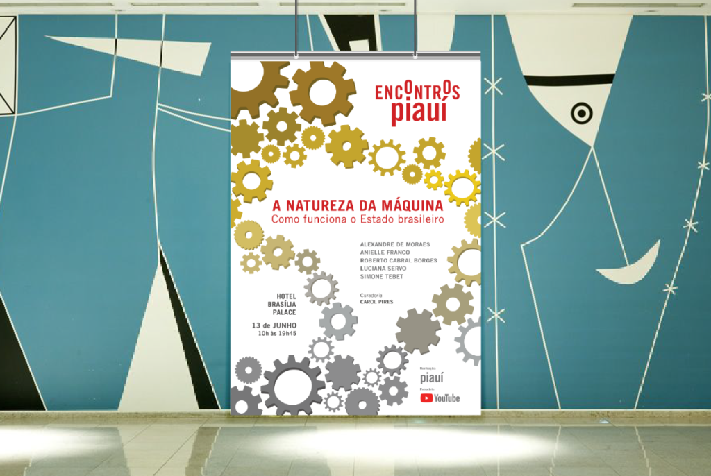
This year, Piauí magazine in partnership with Youtube held the meeting “The Nature of the Machine – How the Brazilian State Works” with the guests: Alexandre de Moraes (STF), Anielle Franco (Racial Equality), Luciana Servo (Ipea), Roberto Cabral Borges (Ibama) and Simone Tebet (Planning and Budget) at the Hotel Brasília Palace in June 2023. We created the brand and visual identity project, signage and graphic materials for the event.
This year I worked with Leste Design in the visual identity team for three projects:
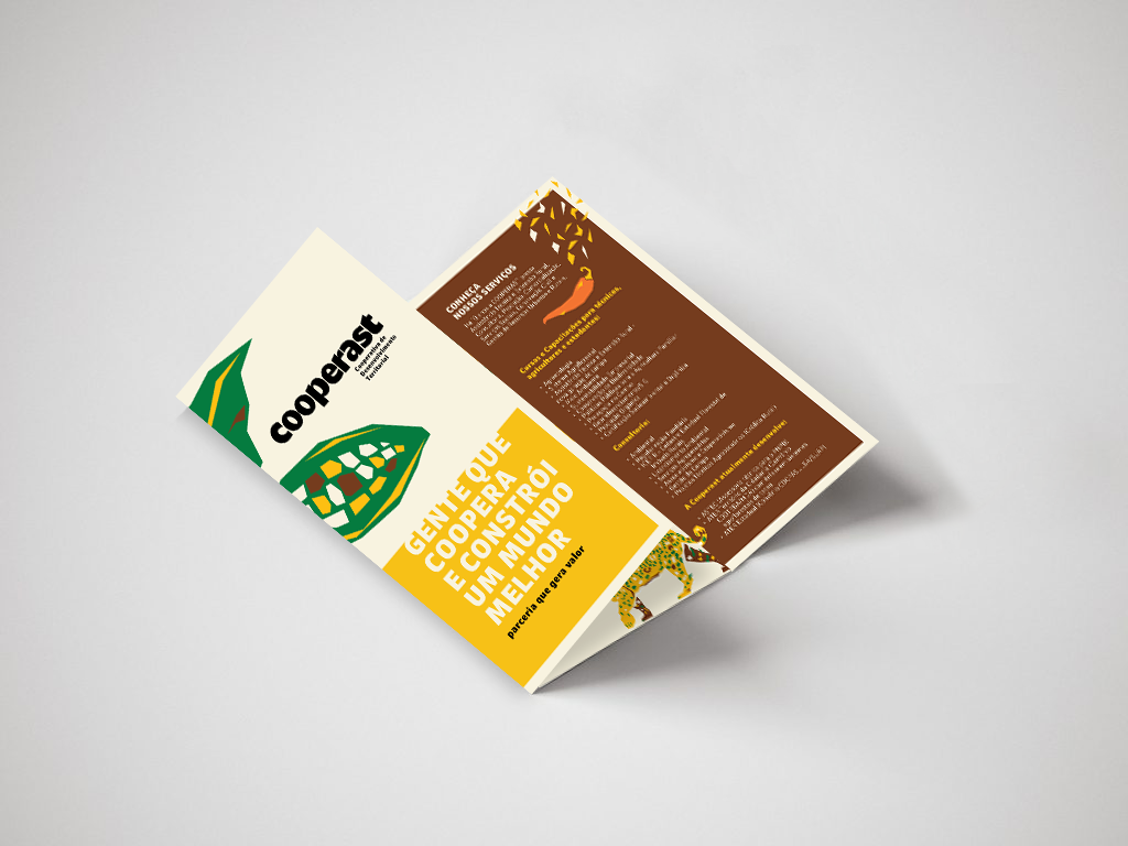
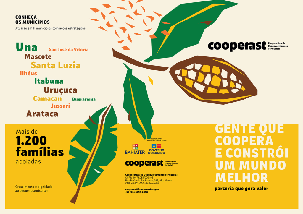
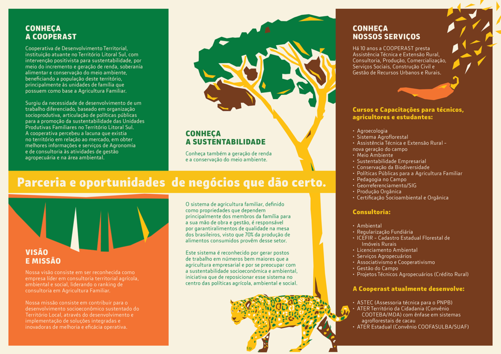
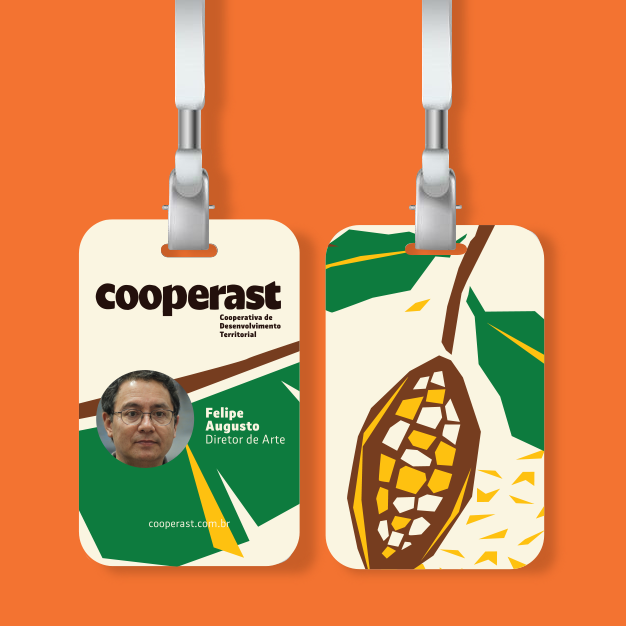
Cooperast
Territorial Development Cooperative
Focus on positivist intervention for sustainability and technical assistance for rural producers and families based on Family Agriculture.
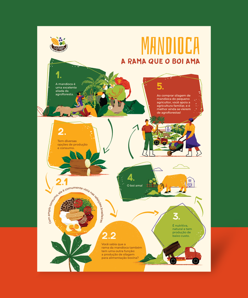
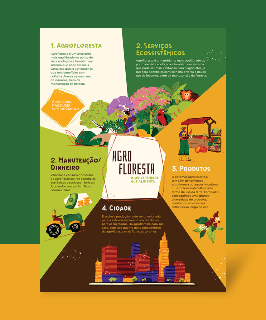
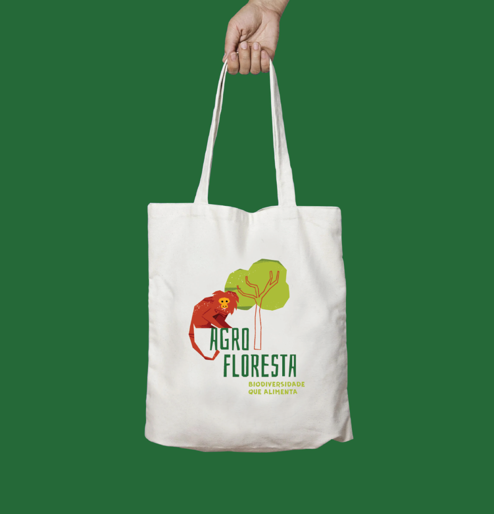
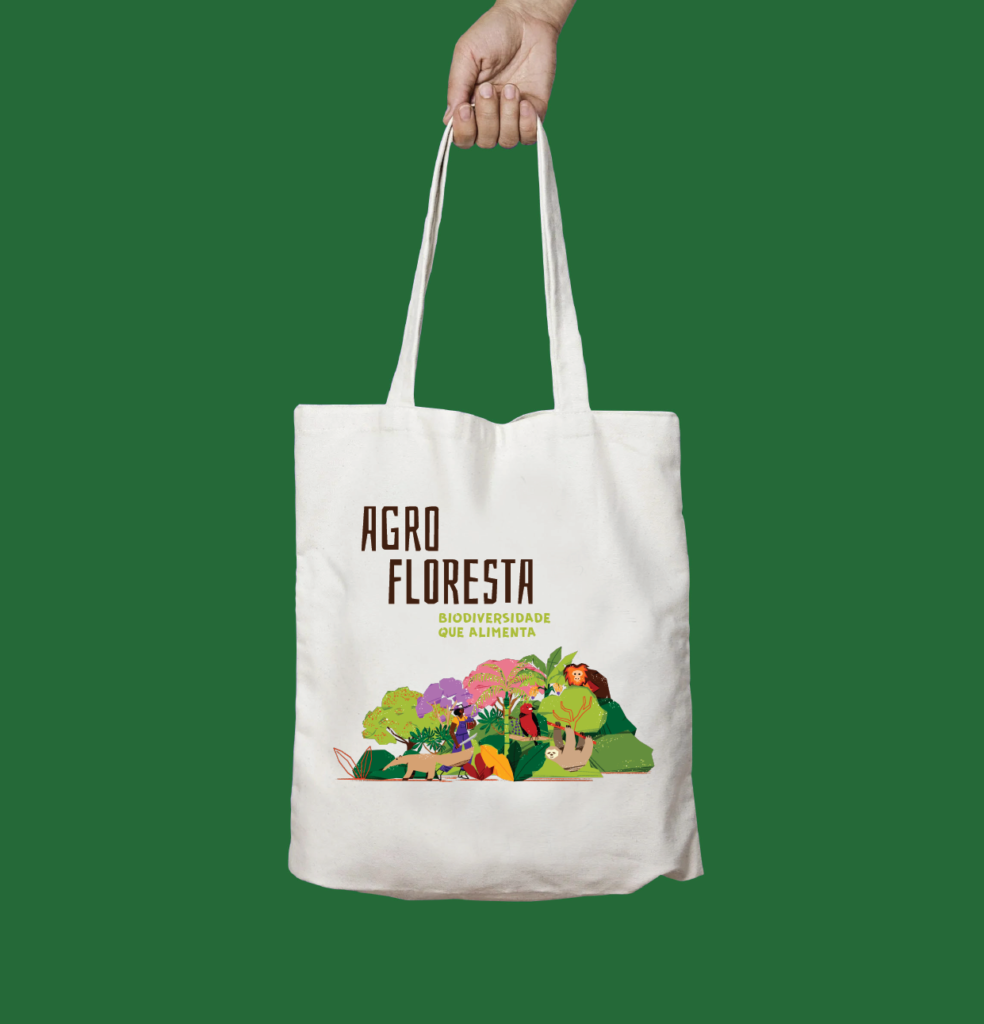
SIAMA
Sistemas Agroflorestais na Mata Atlântica
It aims to promote agroforestry in the Atlantic Forest as a regional development strategy in order to contribute to the mitigation of climate change and the fight against poverty.
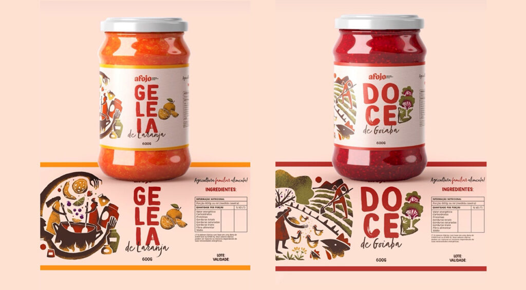
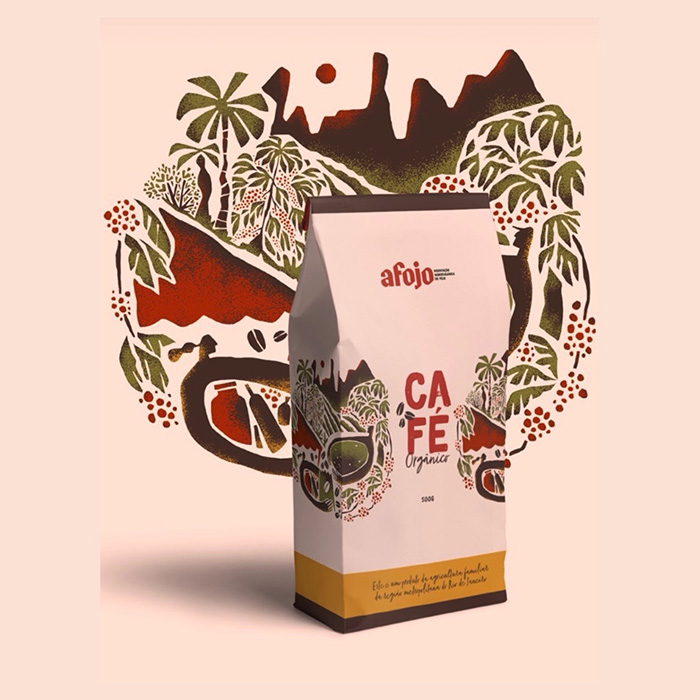
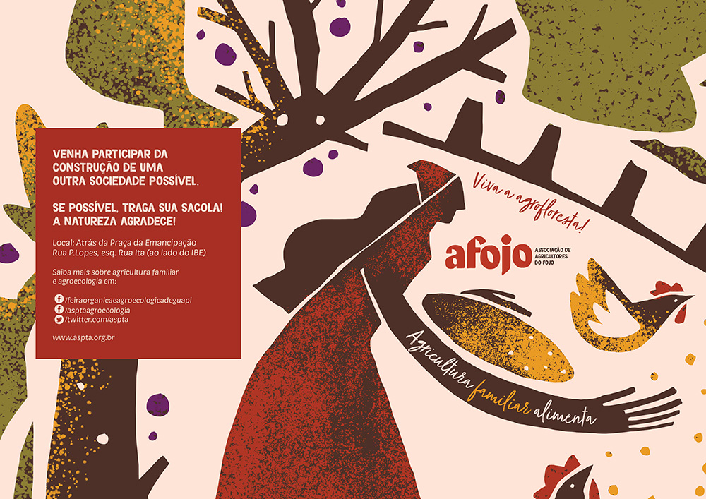
AFOJO
Association of Rural Producers and Artisans of the Fojo Microbasin
Community formed by families from Guapimirim, in the state of Rio de Janeiro, with a history of growing food.
Creative and design direction: Felipe Augusto (Leste Design) Planning and Production: Gabriela Laguna, Marina Bigardi, Nabila Illustration: Eduardo Liniker (Siama and Cooperast) and Thiago Limón (AFOJO) Design: Natasha Gompers and Eduardo Liniker Afojo and Cooperast logo: Flora de Carvalho
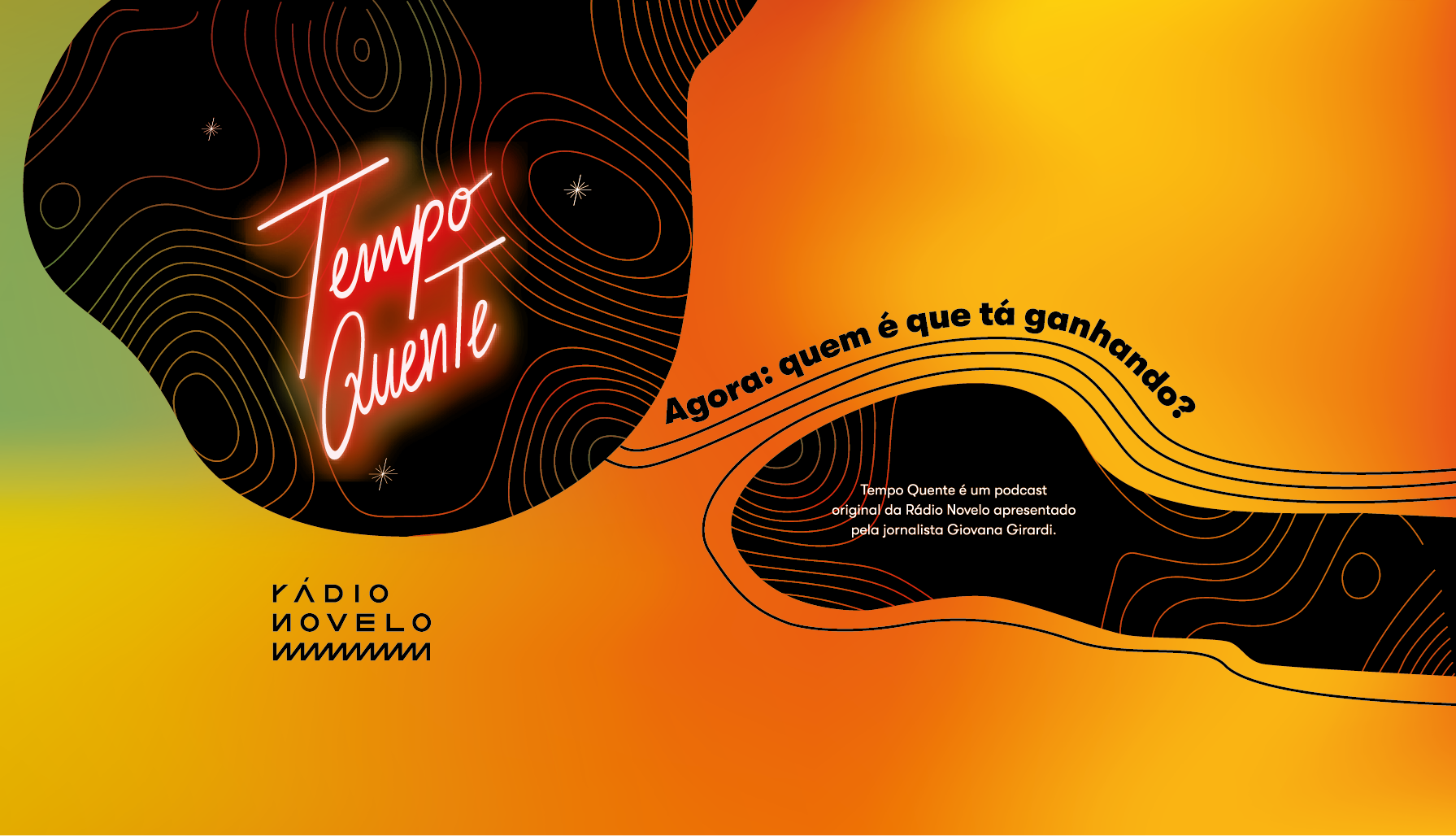
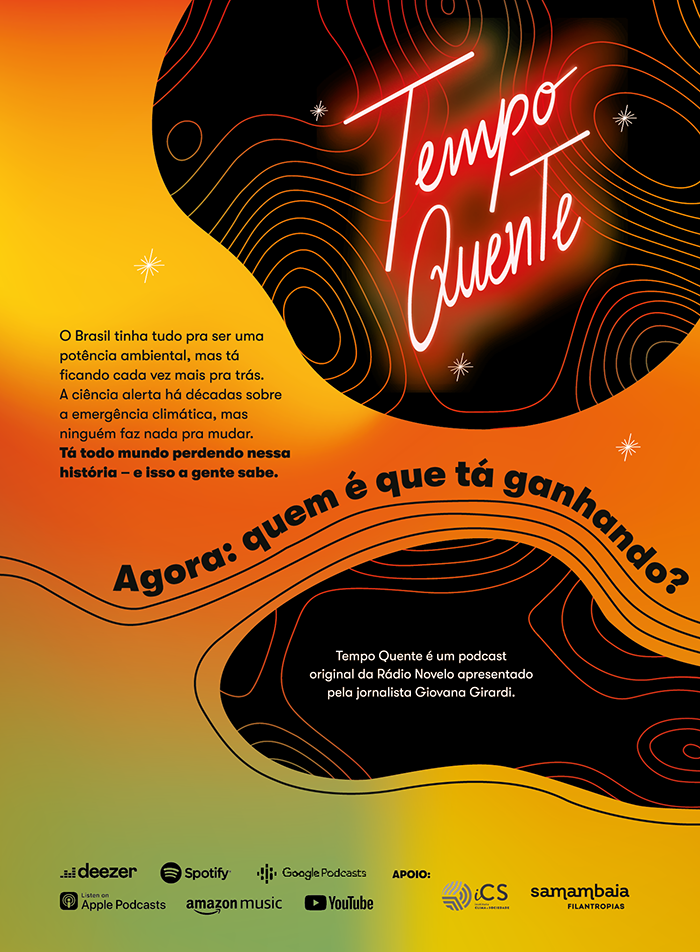
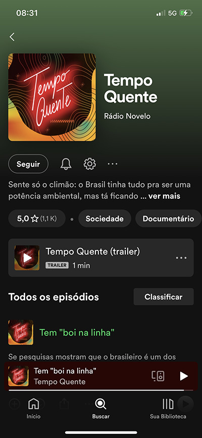
Visual Identity and Lettering of the Tempo Quente podcast, produced by Radio Novelo.
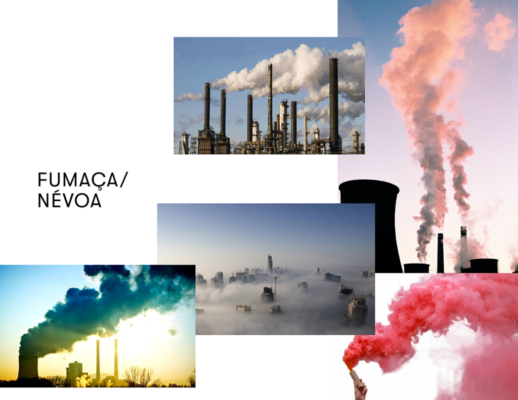
Tempo Quente podcast investigates how industrial, land and agricultural lobbies govern the political and economic forces that prevent Brazil from acting in the fight against climate change. Global warming, deforestation, consequences for the economy such as the increase in the value of energy and the planting of food are some of the many symptoms that are increasingly worrying in our reality.
The idea is to present how these different lobbies work and reveal how these actors historically act in order to maintain old economic models that prevent Brazil from reducing its greenhouse gas emissions and, at the same time, protect its population from the impacts of climate change. weather. Tempo Quente will introduce the actors who benefit from this climate apocalypse and why no one is doing anything to change it.
The podcast has 8 episodes, in narrative format, presented by journalist Giovana Girardi.
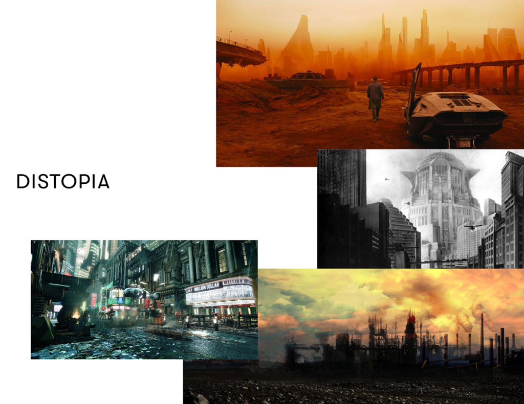
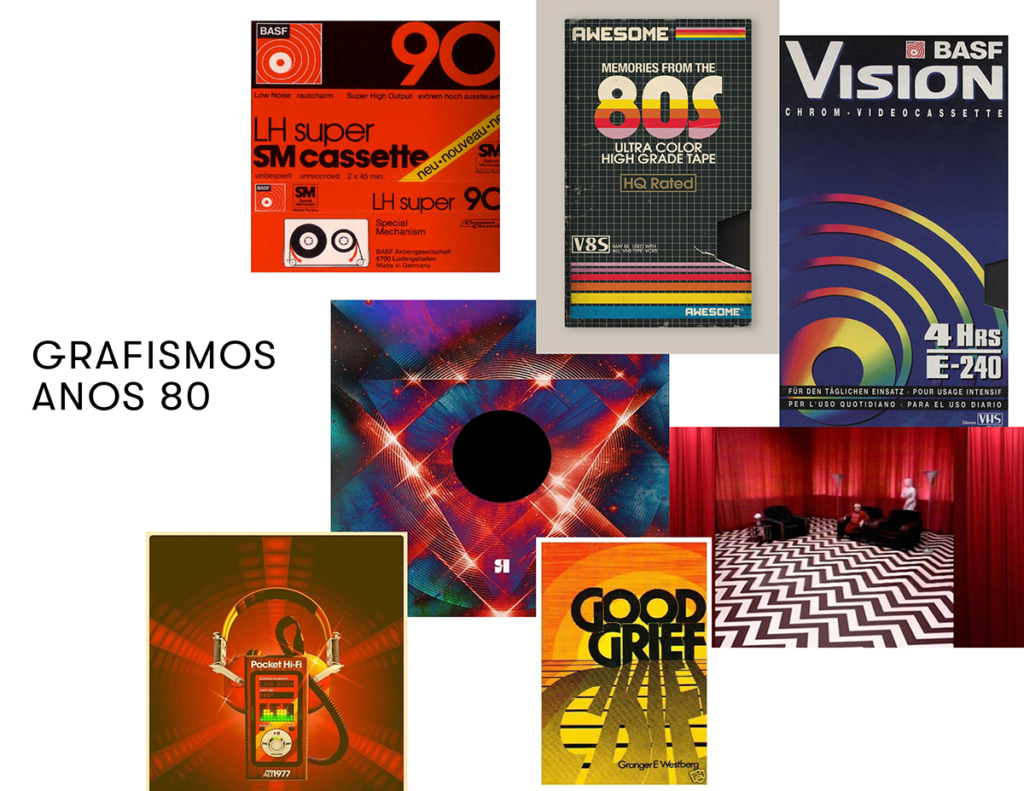
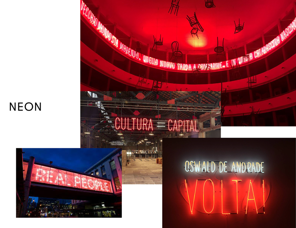
In the first meetings of the project, we defined the briefing about a dystopian world with a film noir aesthetic, mixed with a futuristic influence, the chaos of the city, neon elements and a dismal setting. The main references were the film Blade Runner with an 80's typography, close to the title of the film Dirty Dancing. In addition, we use elements of tecnobrega aesthetics, vivid colors and neons.
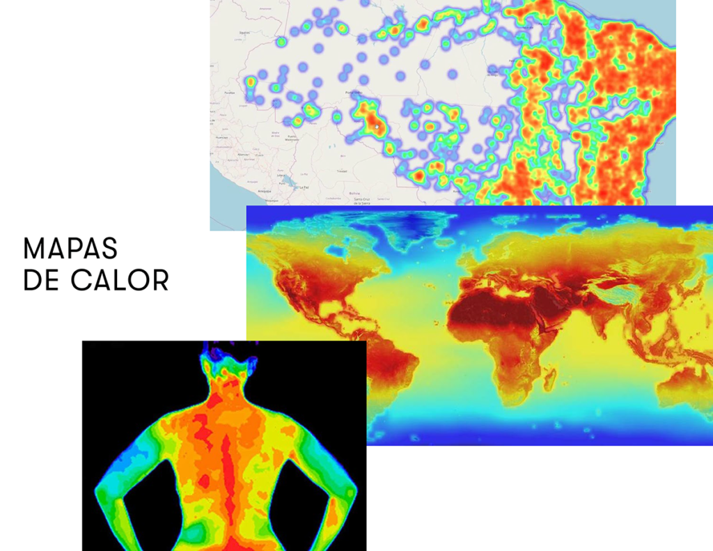
Based on these aesthetic references, I worked with the idea of waves/heat spots mixed with the topography drawings, as if the earth's surface was being mapped and studied. The warm and flashy colors are part of the warmth and alertness present in the concept of the name. Neon conveys the idea of pop and commercials, contrasting with a theme that is often trivialized and devalued by the media and agents.
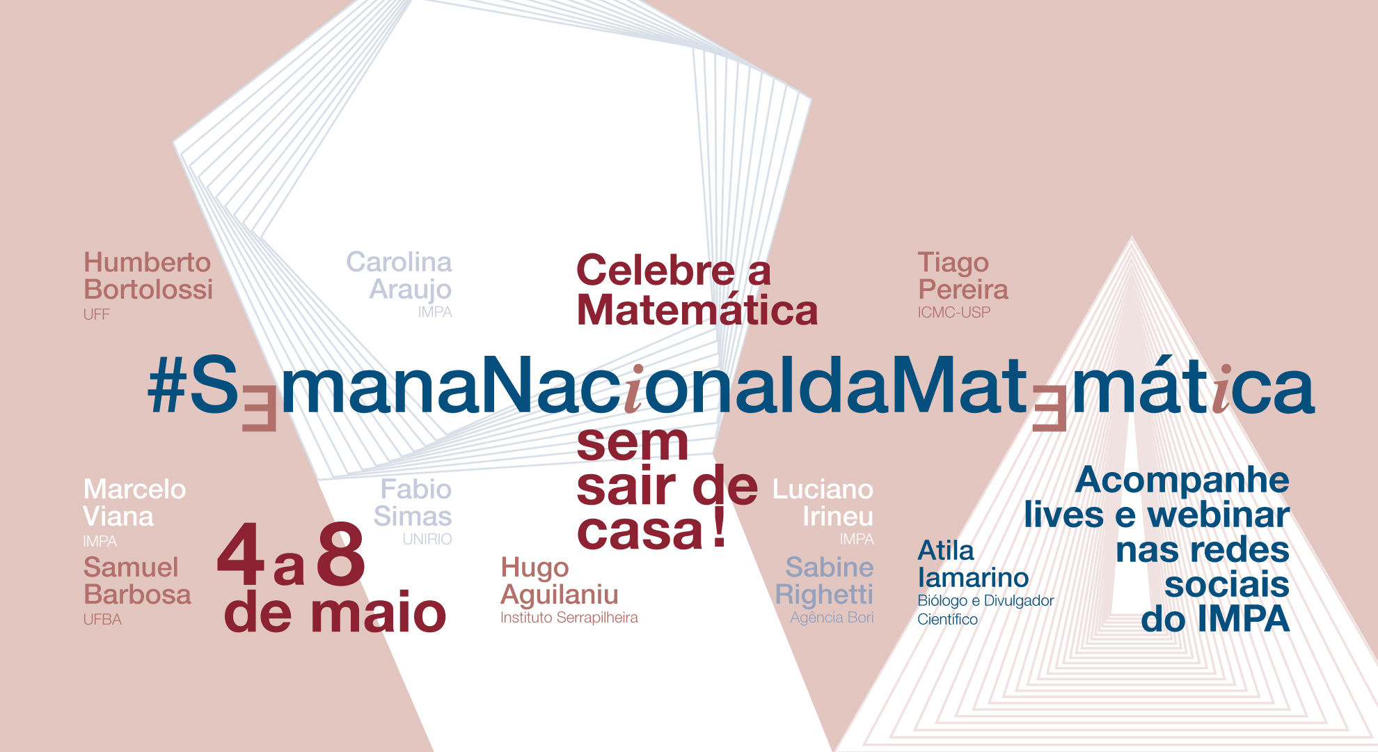
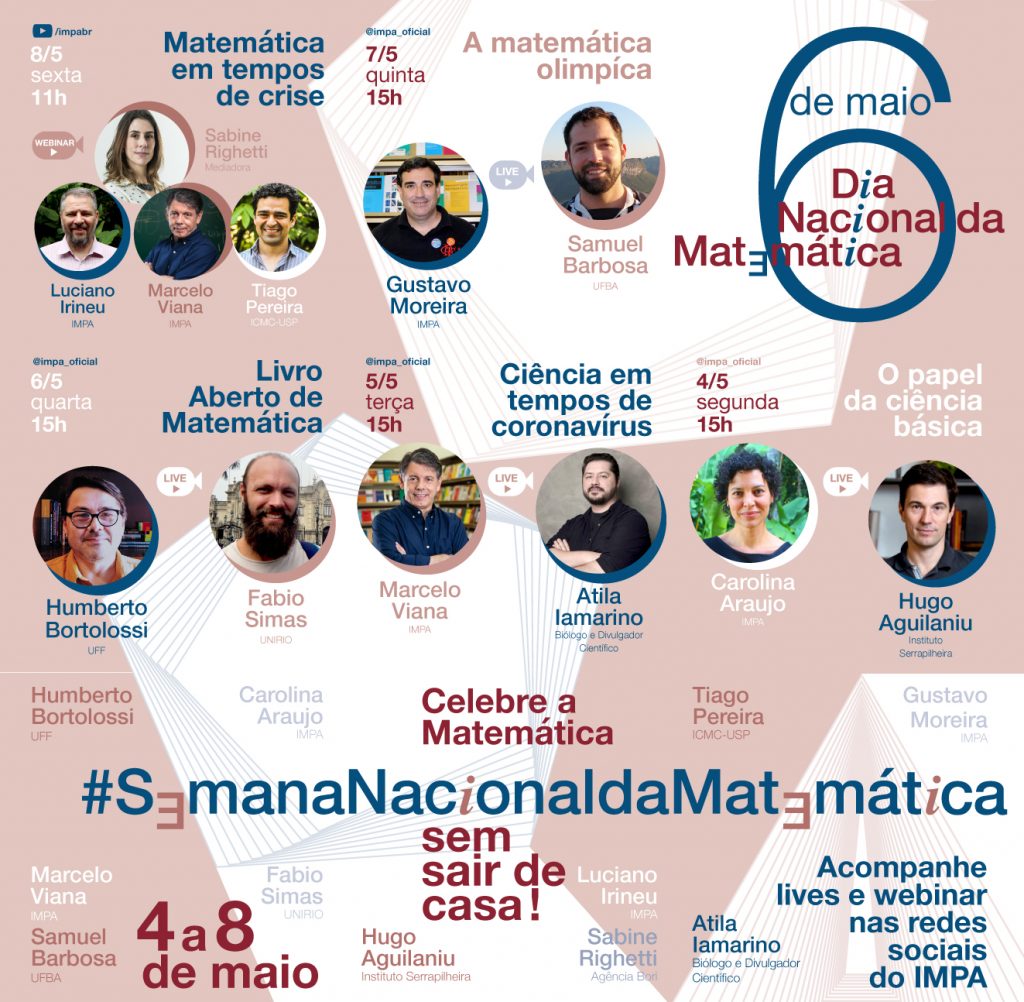
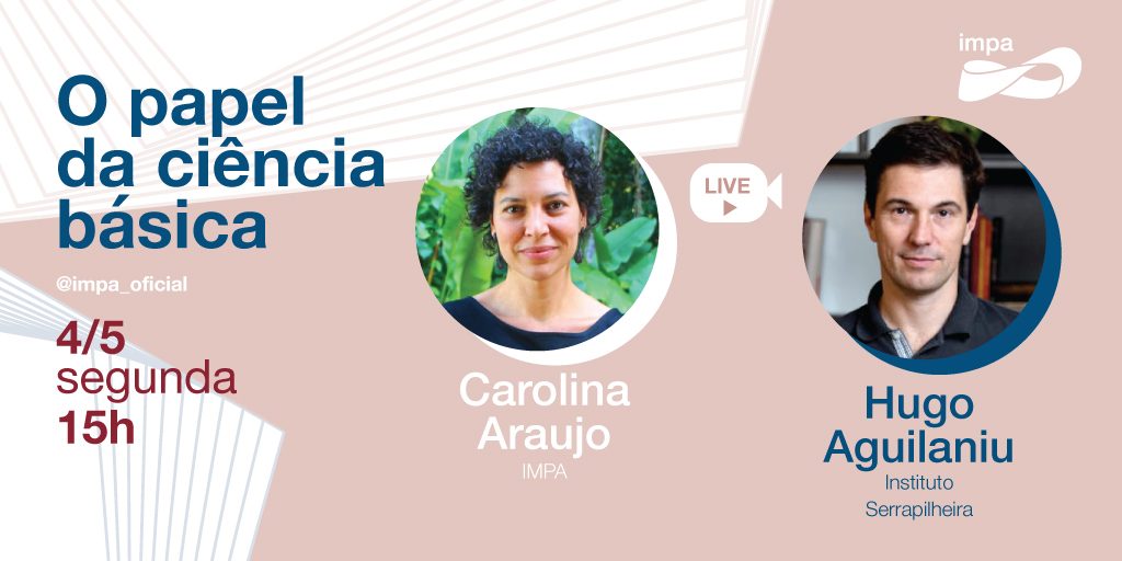
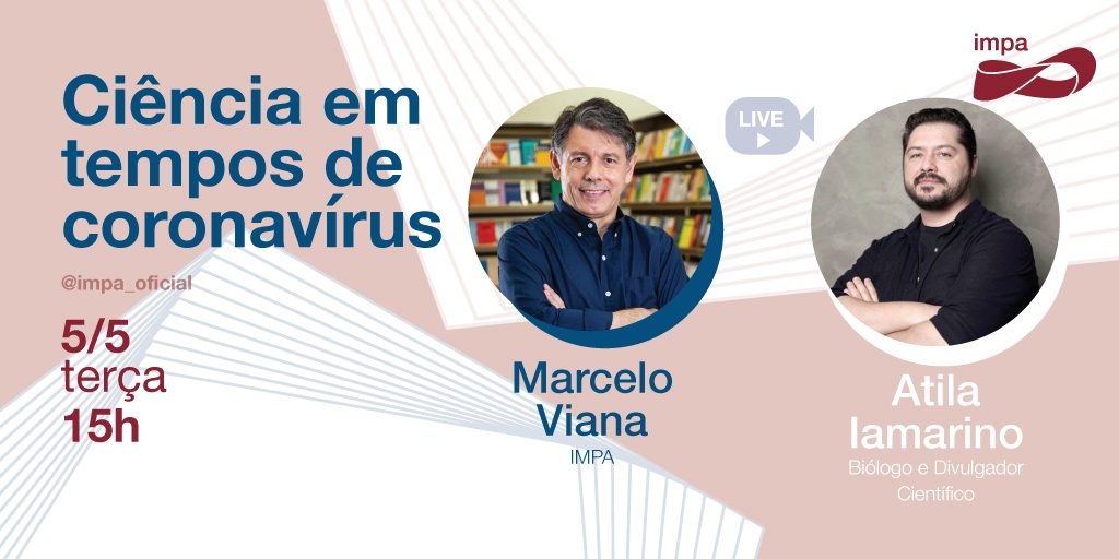
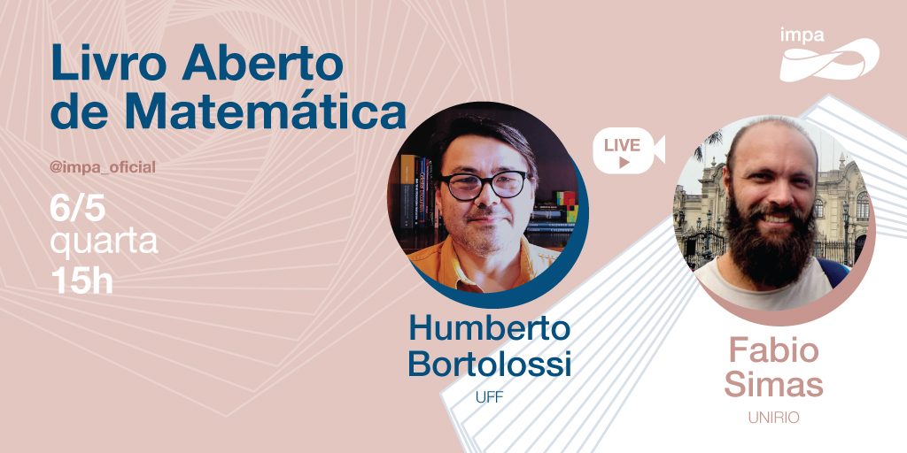
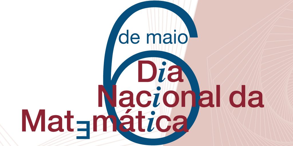
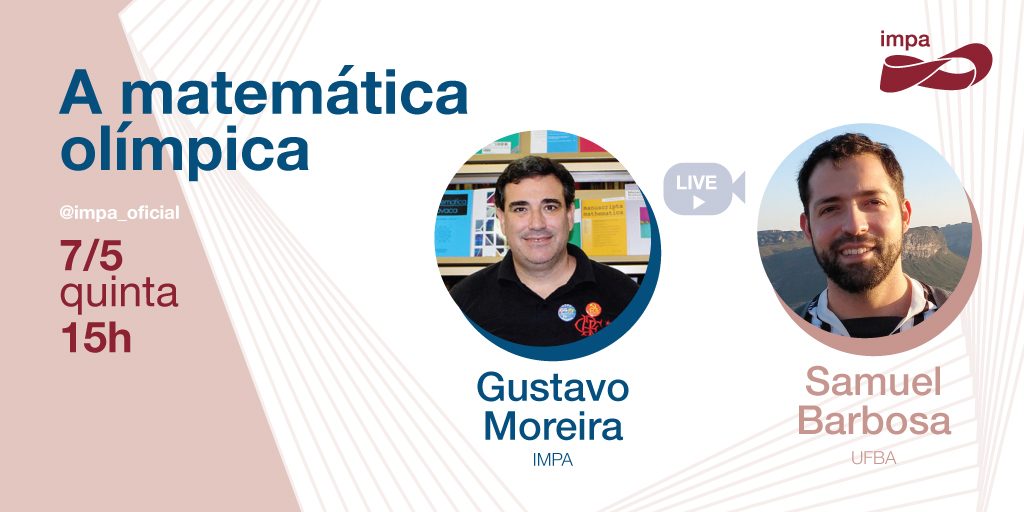
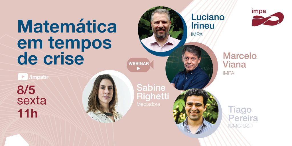
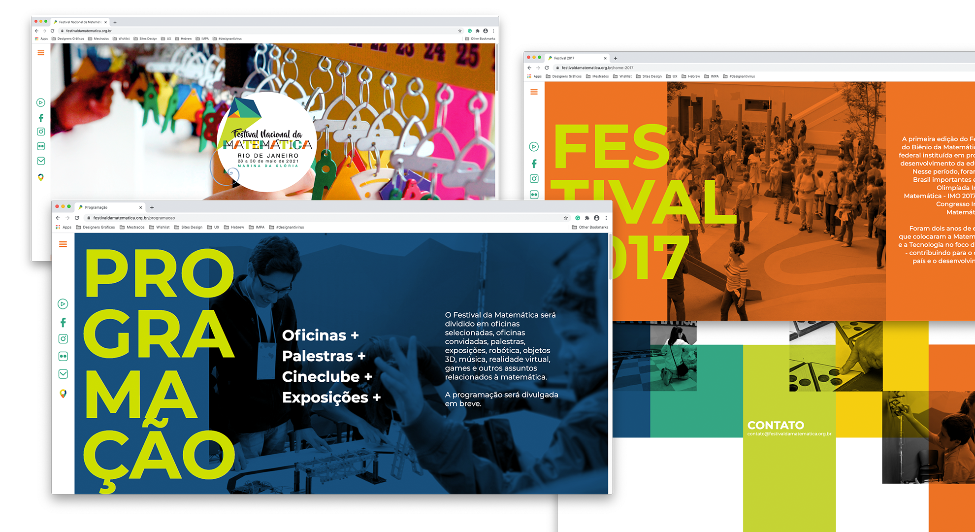
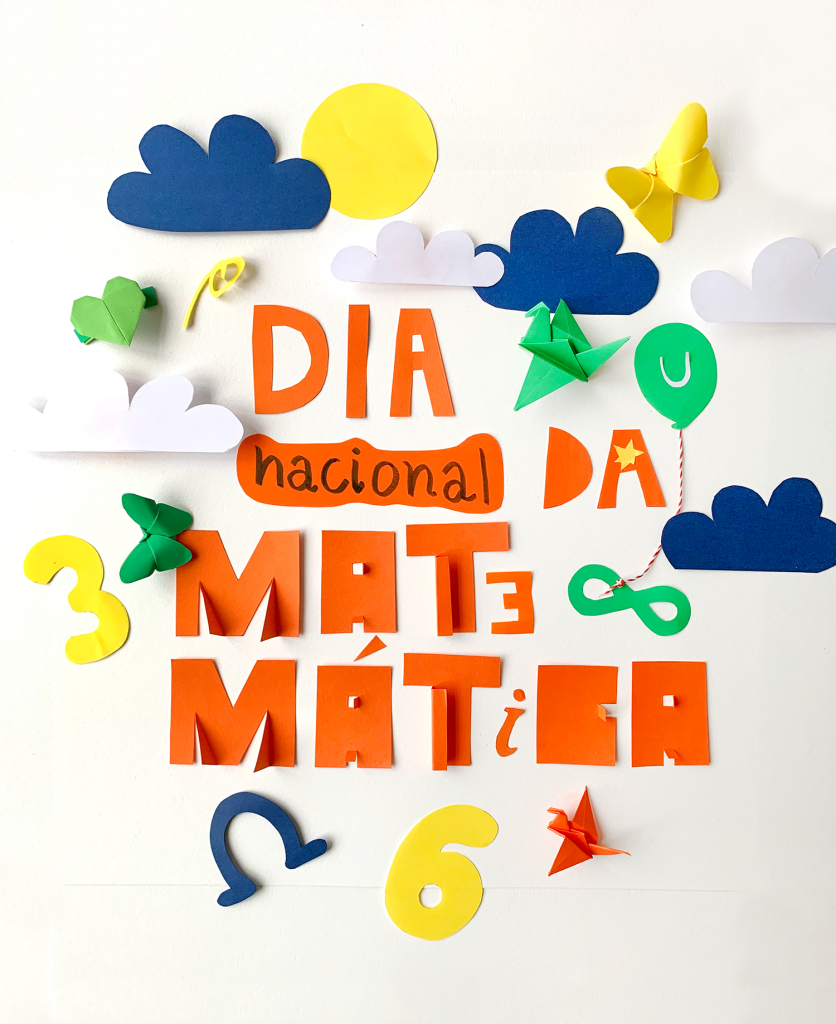
The National Day of Mathematics is celebrated on May 6, in honor of the Brazilian mathematician, writer and educator Júlio César de Mello e Souza, known as Malba Tahan. Impa promoted a series of virtual activities to celebrate this very important day. Topics such as the role of basic science, the pandemic of the new coronavirus, the importance of science and mathematics in combating Covid-19, among others, were aborted in lives by the director general and major researchers at IMPA.
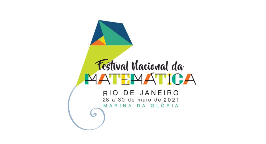
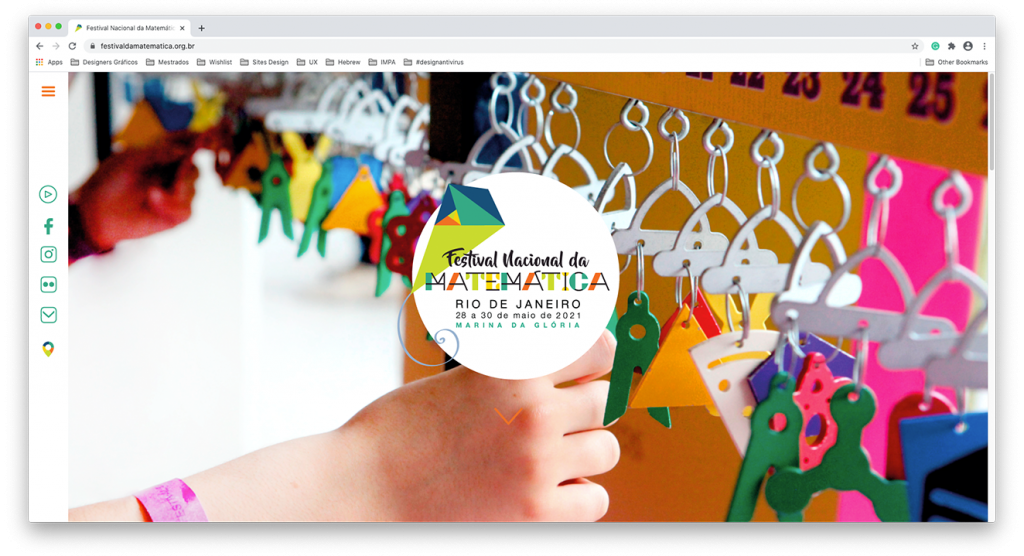
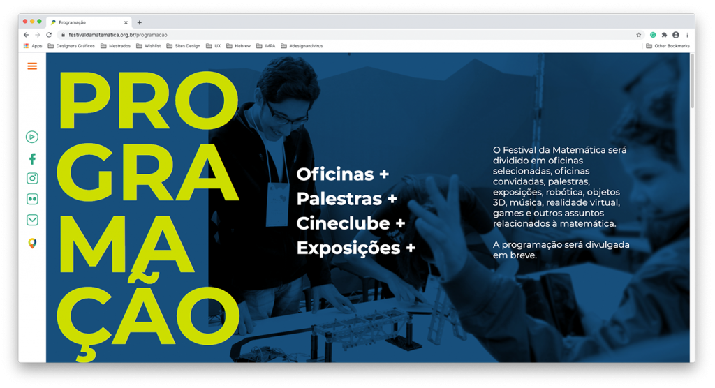
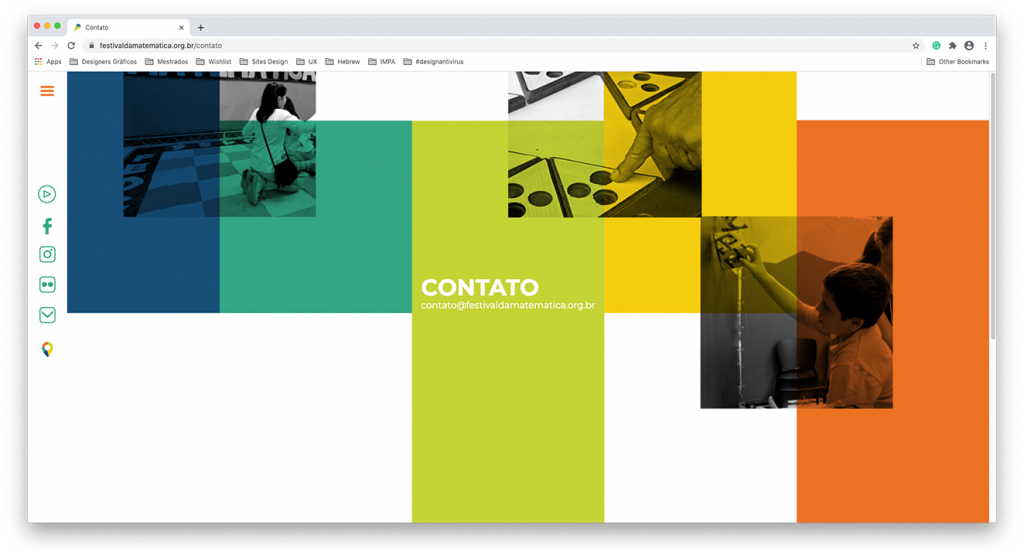
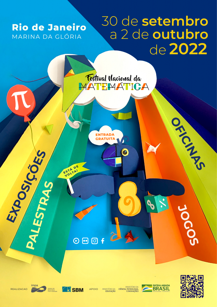
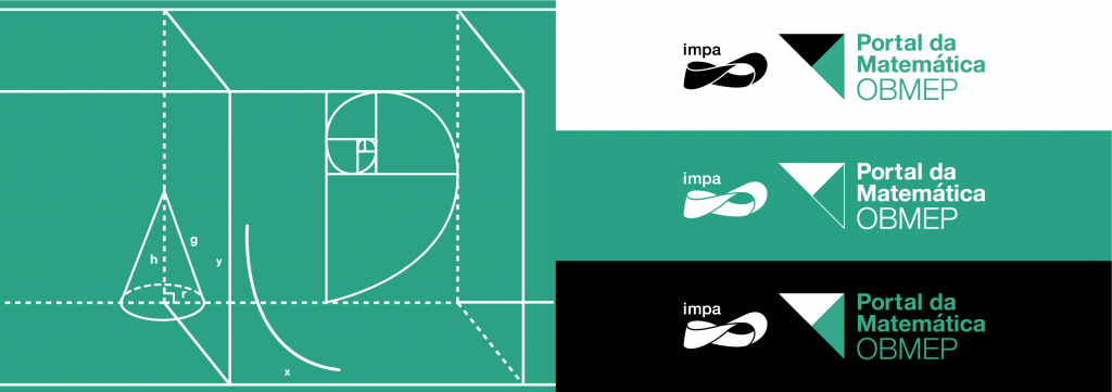
The visual identity of the event was developed from mathematical symbols to create a connection between the themes and the speakers.
The National Math Festival was inspired by the American National Math Festival, which takes place in Washington every two years.
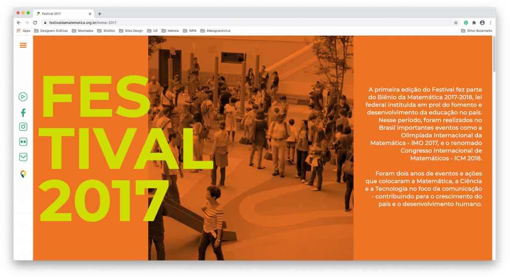
The first edition of the Festival was part of the Biennium of Mathematics 2017-2018, a federal law instituted for the promotion and development of education in the country. During this period, important events were held in Brazil such as the International Mathematical Olympiad – IMO 2017, and the renowned International Mathematic Congress – ICM 2018.
It was two years of events and actions that put Mathematics, Science and Technology at the center of communication – contributing to the country’s growth and human development.
Held between April 27 and 30, 2017, the first edition of the Mathematics Festival took place in the city of Rio de Janeiro and was held in three locations simultaneously. With almost 18,000 visitors, the event brought a diverse audience, from high school and elementary students to teachers, children, parents and grandparents.
Inspired on the visual identity developed in 2017, I worked on a re-reading of the brand for the 2021 edition, the website’s graphic design, publicity posts, presentations and various materials. I sought to explore the color palette as a guide, great titles and a welcoming visual identity for all audiences.
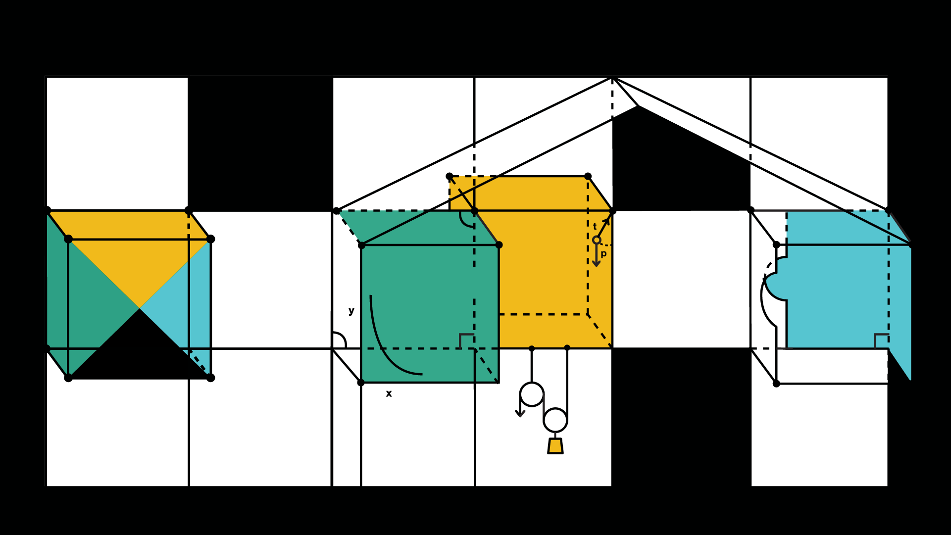
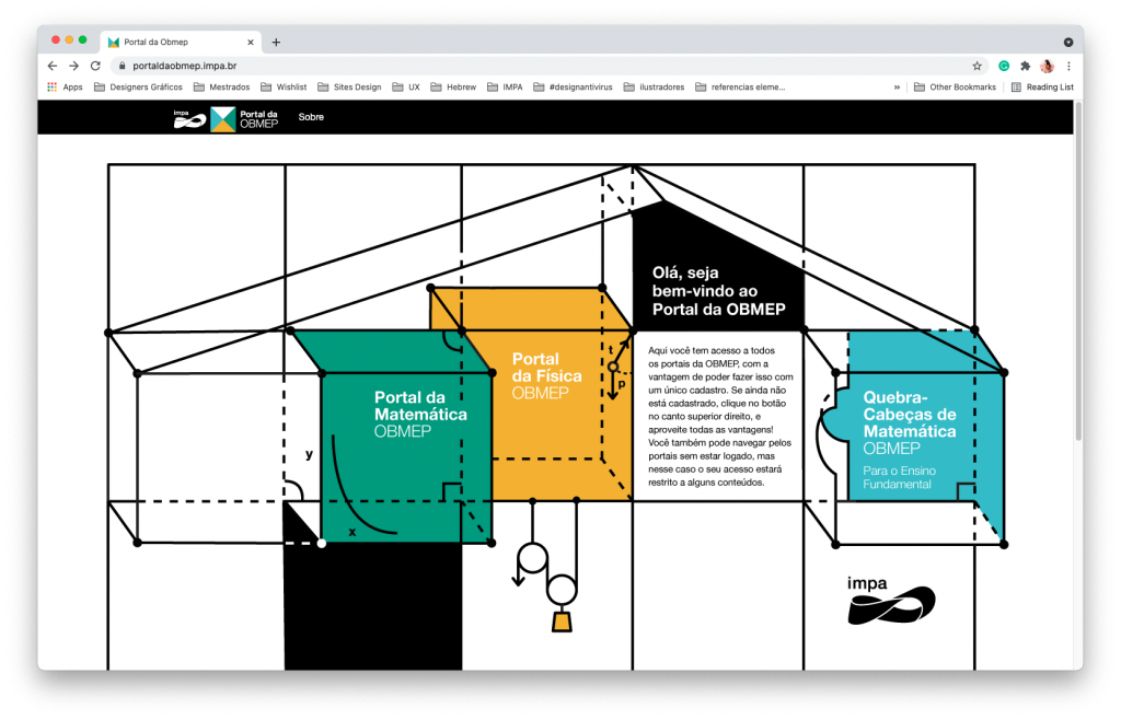
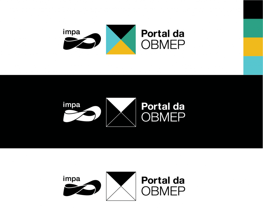
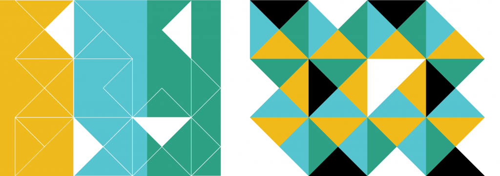
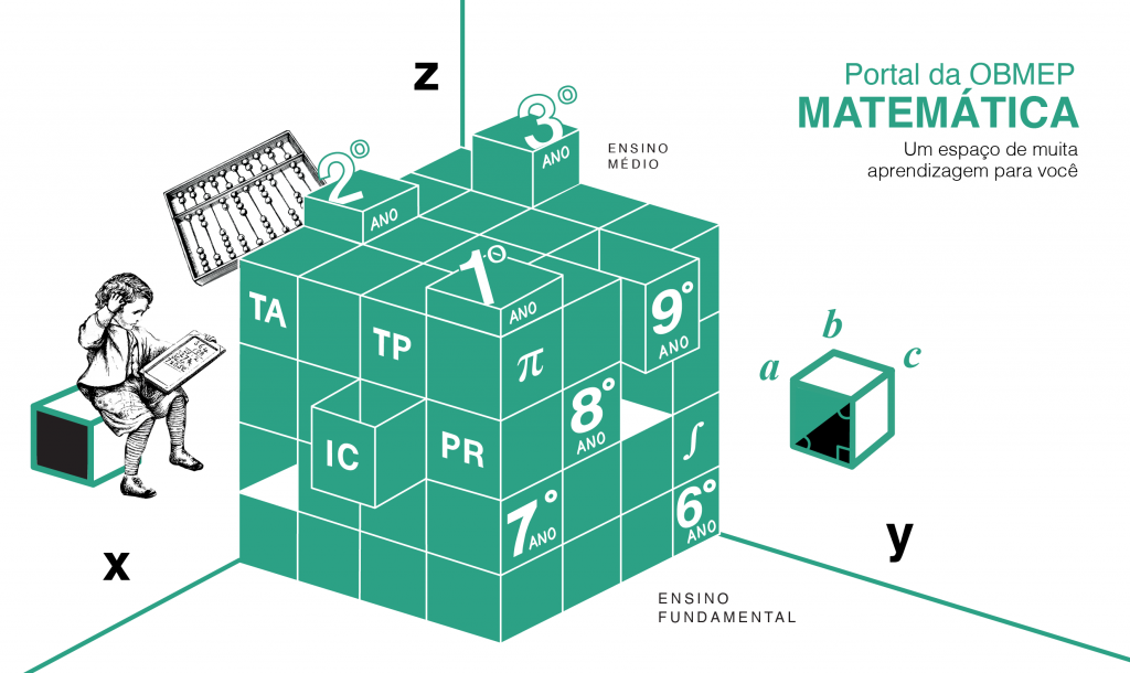
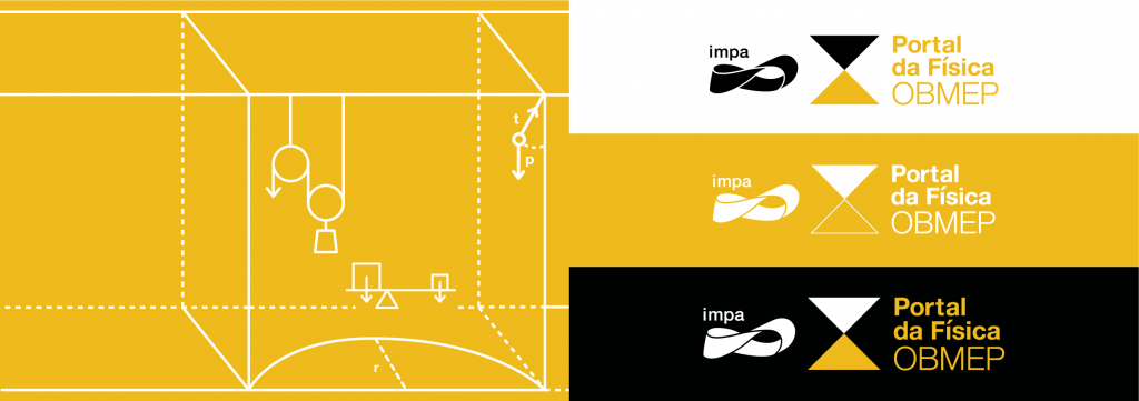
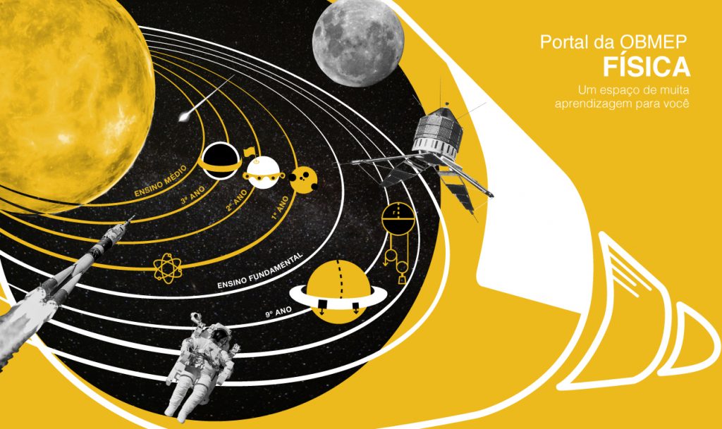
I was responsible for the visual proposal of the OBMEP Portal, a virtual space for elementary and high school students to access video classes content. The idea was to visually refer to a house formed by these three portals and, later on, the Portuguese portal will enter. Each one predominates a color of the portal’s brand, which is a paper divided into four parts and opens up a universe of elements that refer to the themes of each one.
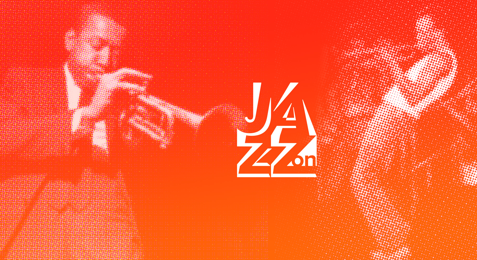
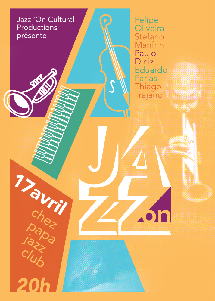
Jazz’On presents characteristics such as contemporaneity, movement and transparency. The project was inspired by the atmosphere of nightclubs and jam sessions where musicians were invited to go up on stage and play with the band without any previous rehearsals. The encounters brought a mixture of unusual styles and combinations.
The main goal of the visual identity of Jazz ‘On is presented features such as contemporaneity, movement, and transparency. The project was inspired by the atmosphere of nightclubs and jam sessions. Jam means to play without a song in mind and a lot of bands use this resource to stimulate creativity and figure out new records. In these meetings, the musicians were invited to go up the stage and play with the band without any previous rehearsals. The producer Jazz’ On makes festivals, shows and albums in French and Brazil.
Creative Process
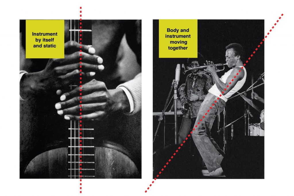
After a few jam sessions, I noticed some standards, organized words that guide me in the graphic project: movement, asymmetry, vibration, light, flexibility, performance, improvisation, and transparency. This combination between the musician and the instrument results in new involuntary impulses and movements that give life to the meetings which generate a unique moment that probably could not be reproduced in a recording of a disc. In the visual aspect, I worked with the word counterpoint that in the music universe is a composition technique that combines two or more distinct melodies performed simultaneously by instruments or voices. However, the work also means também harmonious or complementary contrast. In this case, the contrast worked was leaning the body with energy and movement as illustrated in the image below.
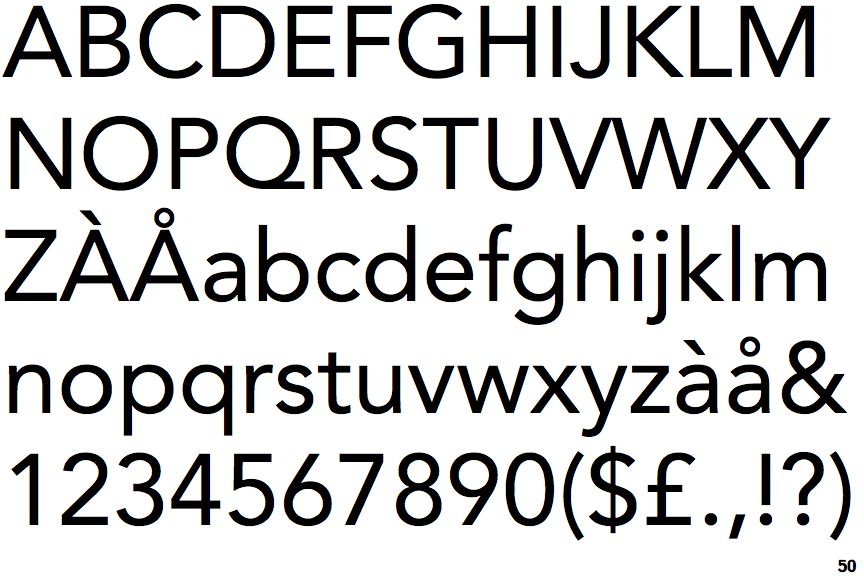
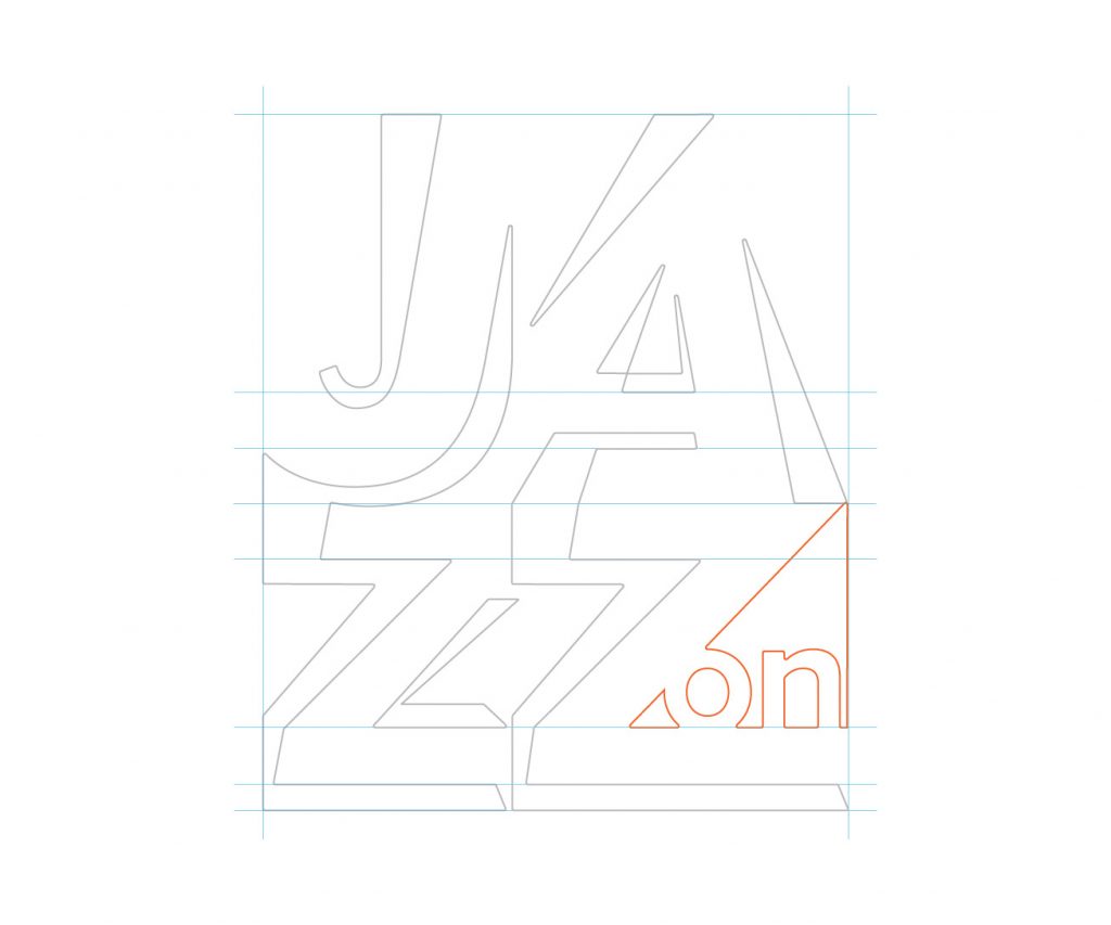
The type of project was Avenir developed by Adrian Frutiger in the 1920s. The French word avenir means the future. Jam session songs are creations of an unexpected and fluid future without planning. As a family inspired by the geometric style, the contrast between static and movement could be sharpened.
The design of the brand was based on the light beams of the stages and the mixture between the regular and italic style of the typography. Being cast, she can adapt to different backgrounds and images as well as in jazz where improvisation is a feature present.
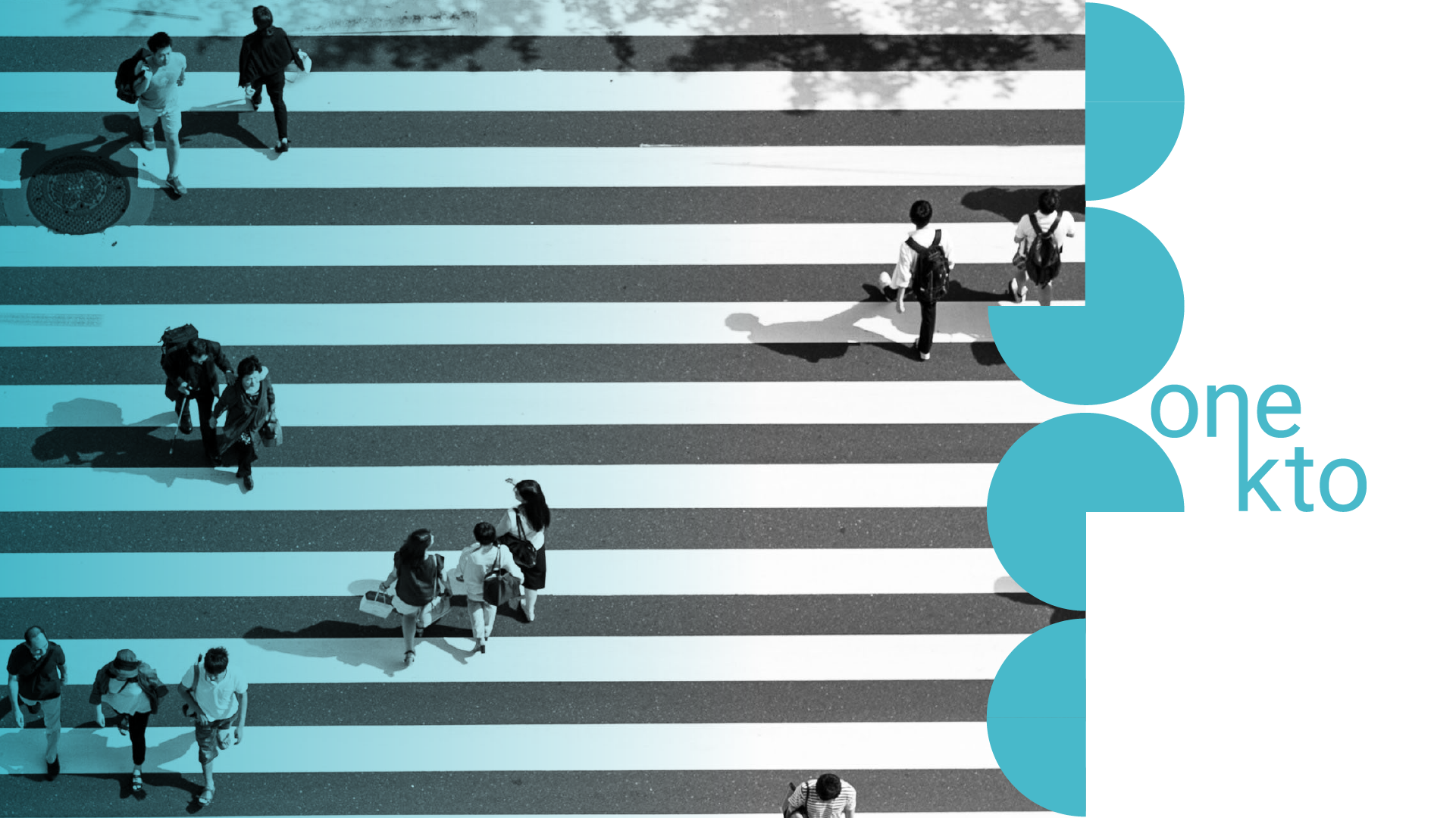
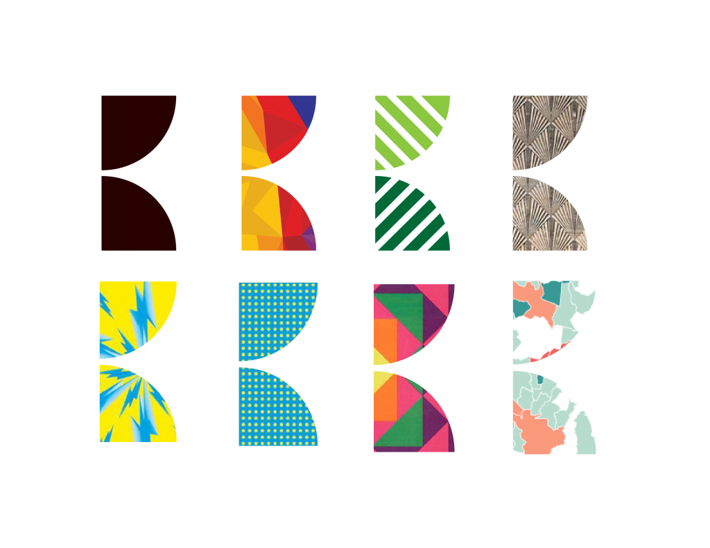
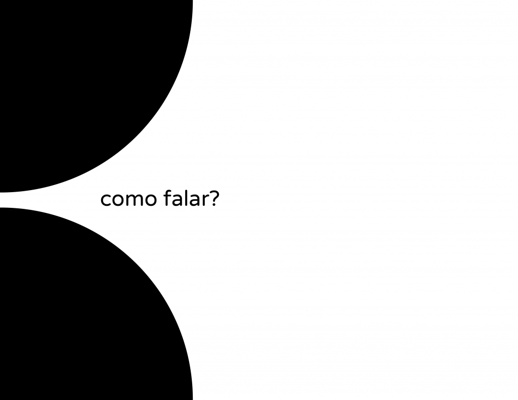
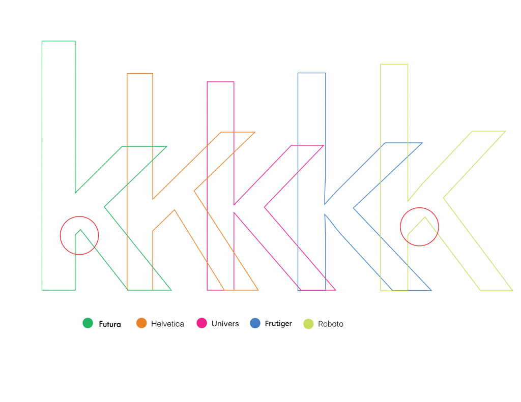
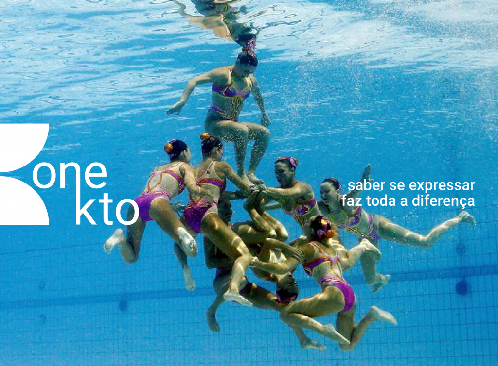
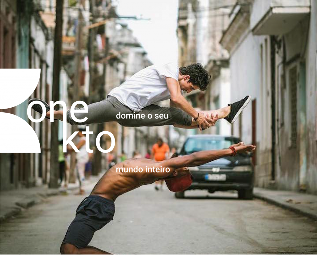
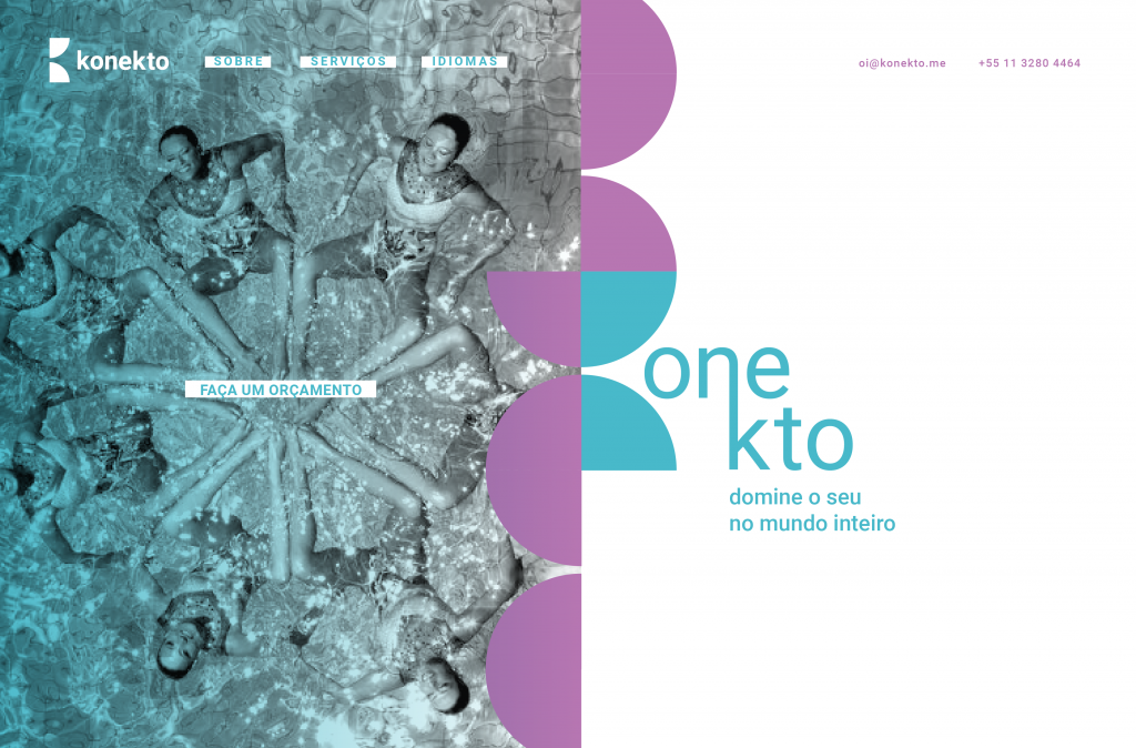
Konekto means connection in Esperanto, a language created with the aim of bringing people and cultures around the world together and whose words can be spoken by everyone, regardless of their origin. Its values come from this thought of connecting companies, people and countries, facilitating communication and understanding between different peoples, languages , and cultures. Konekto is a translator who focuses on audiovisual (subtitle translation) but also different types of translation. I developed a brand in which the letter K is the sum of two-quarters of a circle that comes from the shape of the world and can have different positions and fittings. The brand has a hybrid feature, in which different textures can and should be used, such as its filling. The visual identity aims to show that communication can be diverse and come from other meanings that are not limited to speech and writing.
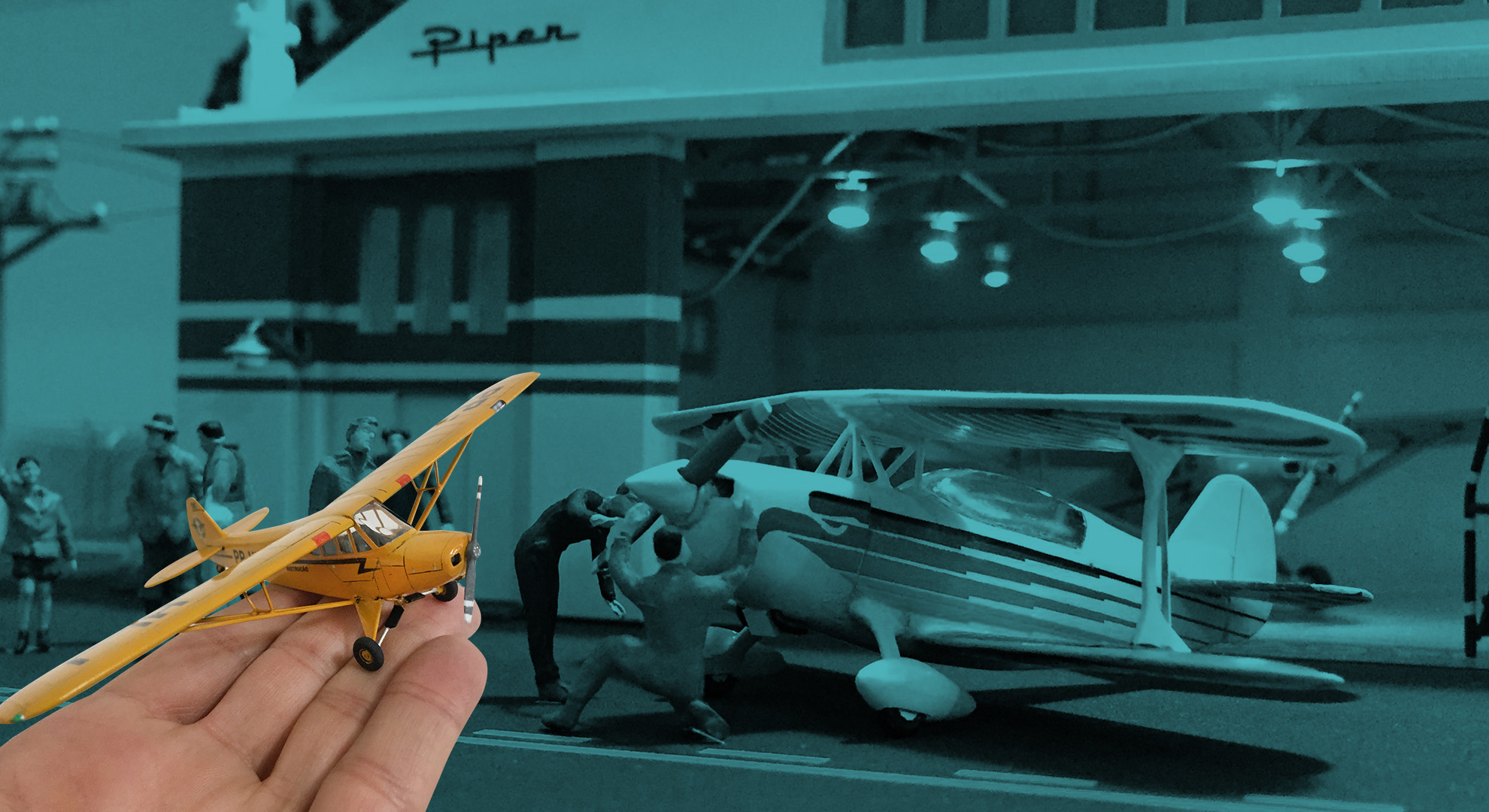
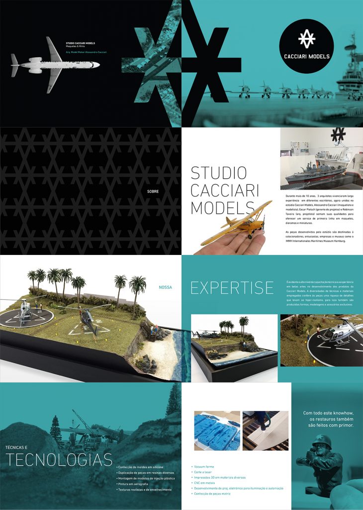
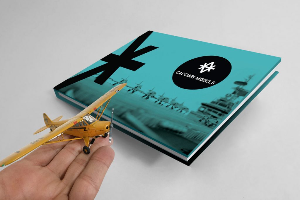
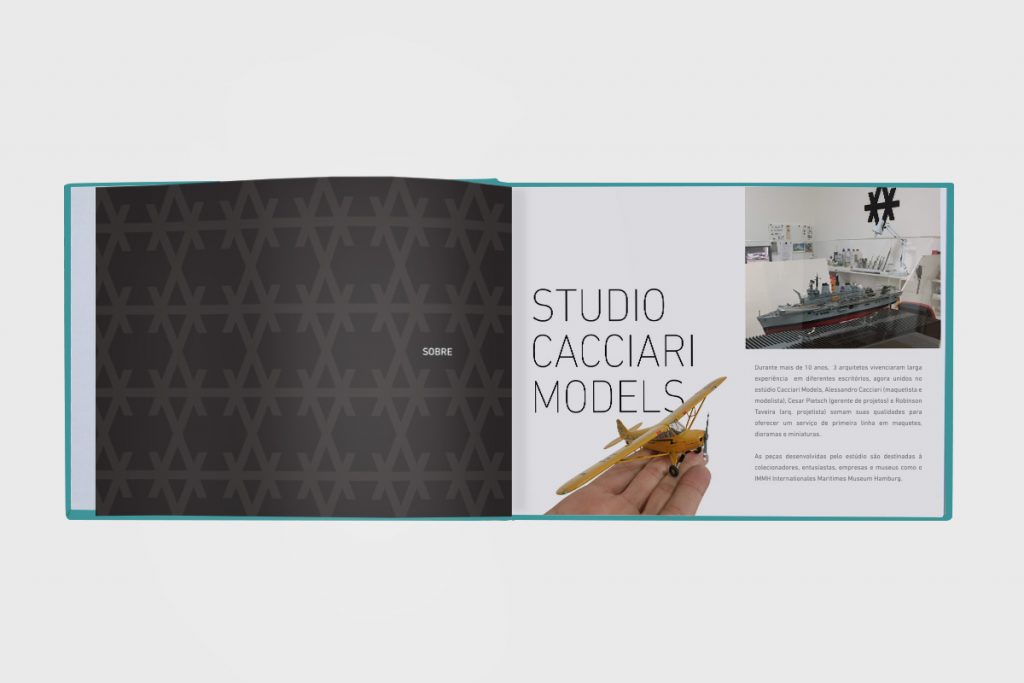
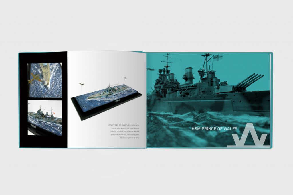
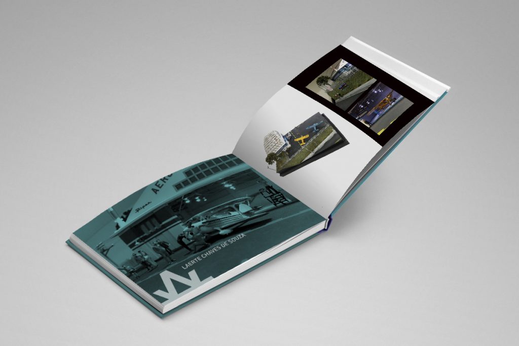
Cacciari Models is a studio that develops miniature projects for the most varied sectors. I created the visual identity project and commercial material. The main idea is to create immersion in the world of scenarios in a reality full of expression. The elaborate technique and details are features that was highlighted in graphic design.
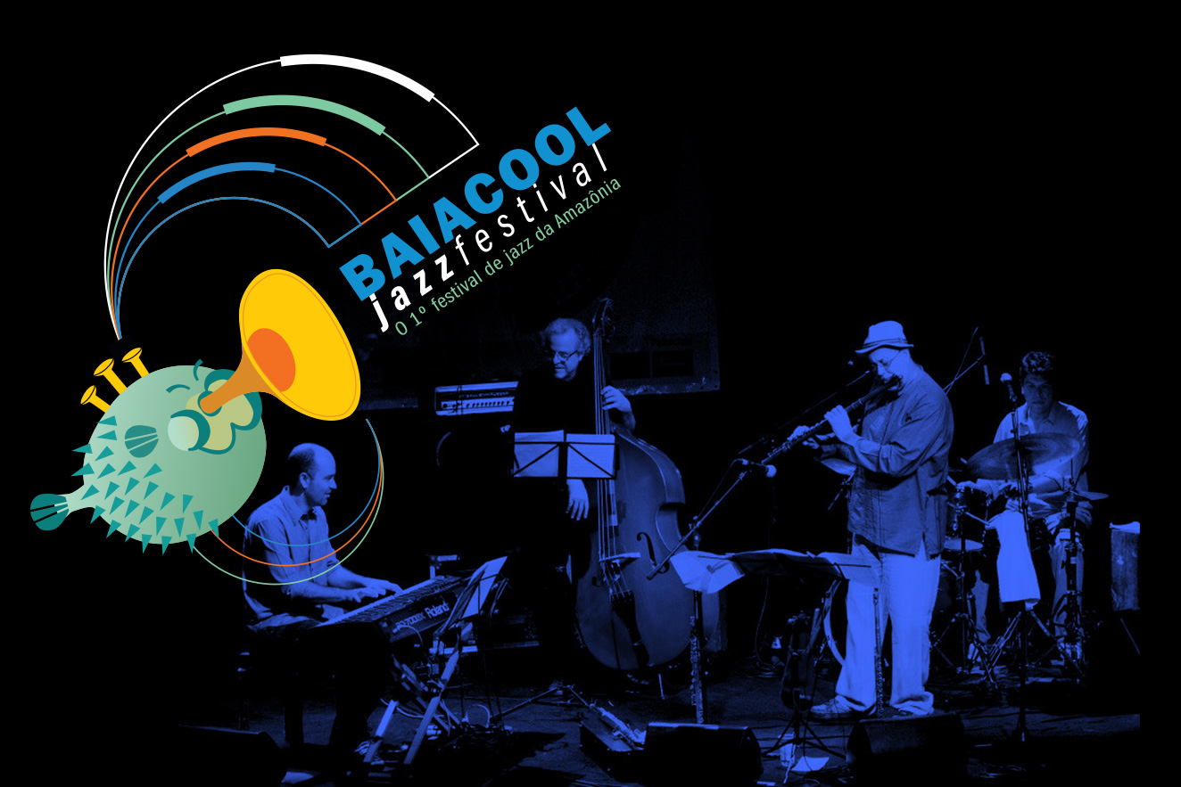
They have passed through the stages of Baiacool Jazz names like Hermeto Pascoal, Leo Gandelman, Marcio Montarroyos, Carlos Malta, Kiko Loreiro, Elephant Foot, Toninho Horta, Mark Lambert, Nika Stuart, Boca Livre, Tom ati, JJ Jackson, Jeff Gardner etc., as well as great names in instrumental music such as Careca Braga, Adelbert Carneiro, Magrus Borges, Delcley Machado, Alcyr Meirelles, Nêgo Nelson, Sebastião Tapajós, Bob Freitas, Trio Manari, MG Caliber, Rafael Lima, Amazon Jazz Band and Minni Paulo Medeiros, the great mentor of the project.
Minni Paulo’s first step towards the Baiacool was in the ’80s, with his band Marginal Society, the first instrumental band from Pará.
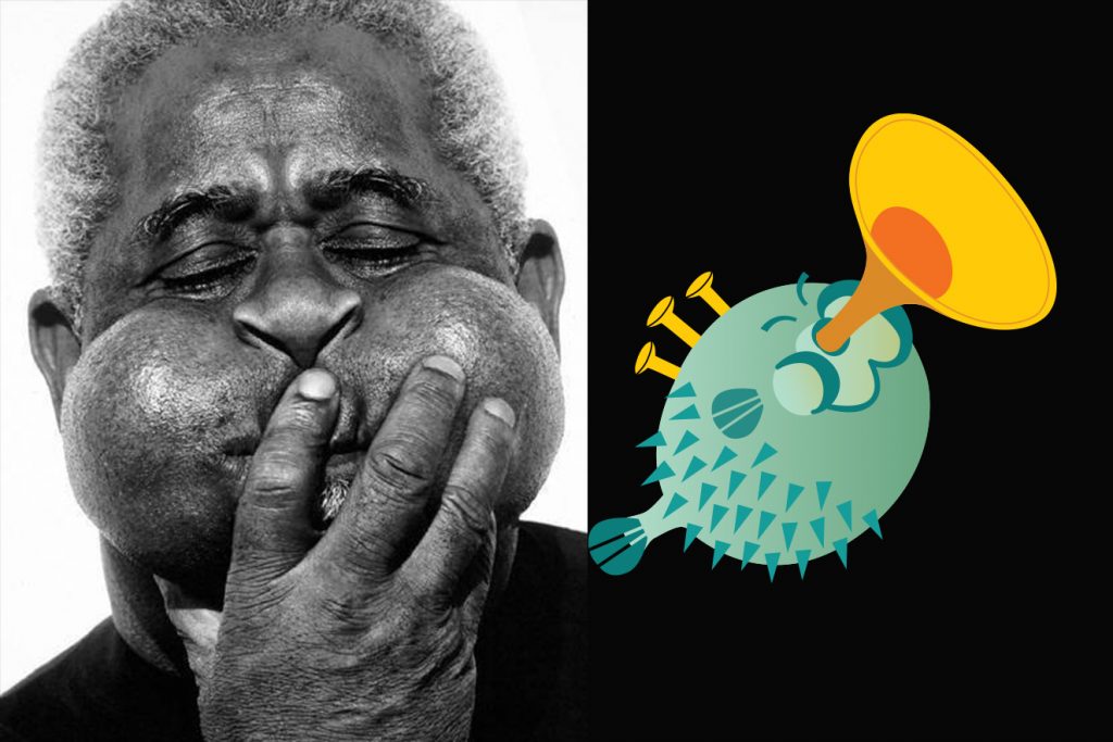
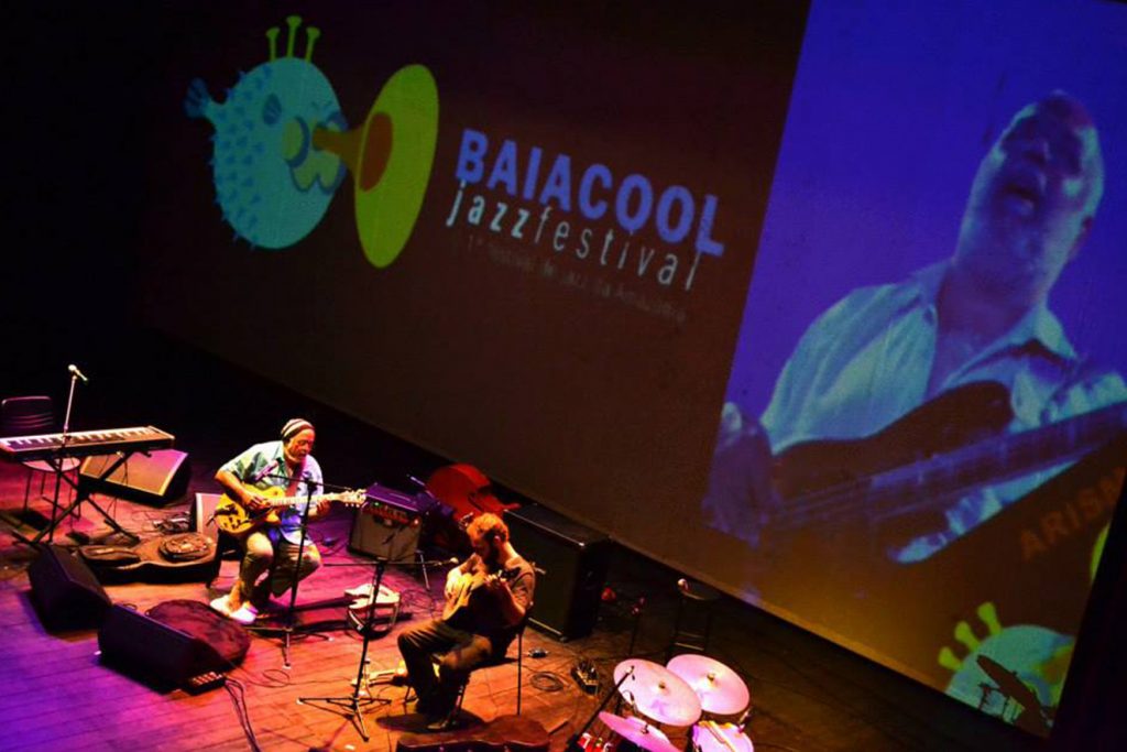
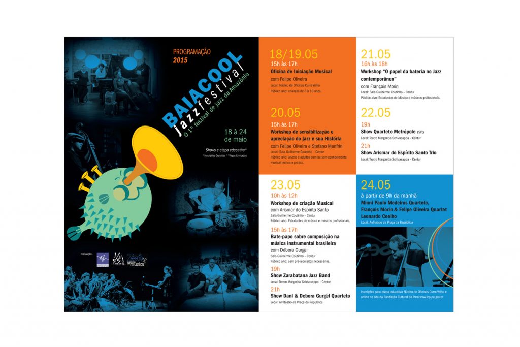
I developed the project to revitalize the brand and presented a new visual identity for the festival that took place in May 2015.