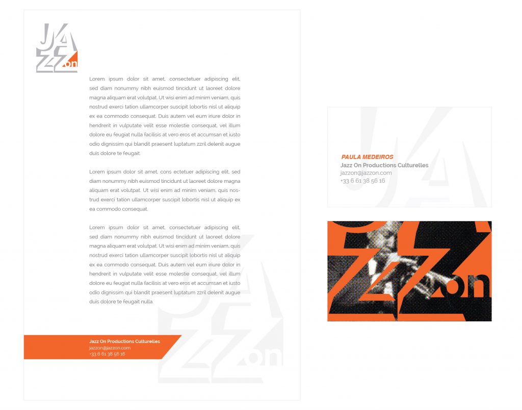
The visual identity project of the producer of concerts, festivals and jazz events.
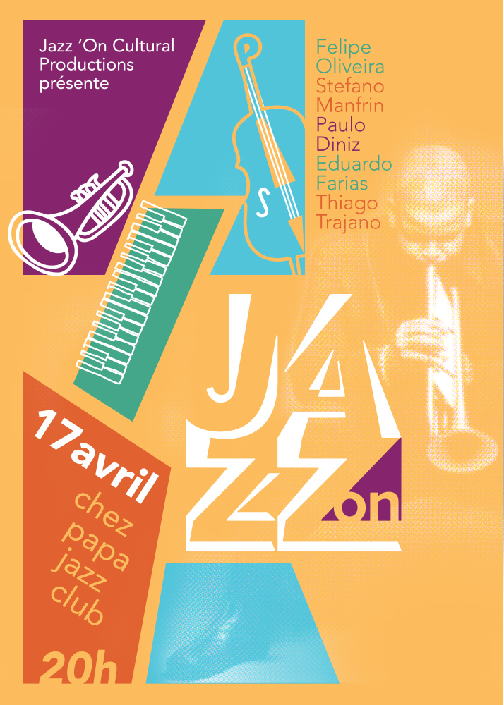
Jazz’On presents characteristics such as contemporaneity, movement and transparency. The project was inspired by the atmosphere of nightclubs and jam sessions where musicians were invited to go up on stage and play with the band without any previous rehearsals. The encounters brought a mixture of unusual styles and combinations.
The main goal of the visual identity of Jazz ‘On is presented features such as contemporaneity, movement, and transparency. The project was inspired by the atmosphere of nightclubs and jam sessions. Jam means to play without a song in mind and a lot of bands use this resource to stimulate creativity and figure out new records. In these meetings, the musicians were invited to go up the stage and play with the band without any previous rehearsals. The producer Jazz’ On makes festivals, shows and albums in French and Brazil.
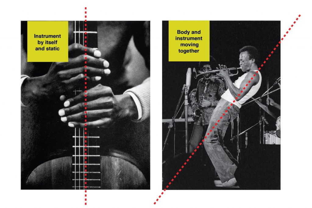
After a few jam sessions, I noticed some standards, organized words that guide me in the graphic project: movement, asymmetry, vibration, light, flexibility, performance, improvisation, and transparency. This combination between the musician and the instrument results in new involuntary impulses and movements that give life to the meetings which generate a unique moment that probably could not be reproduced in a recording of a disc. In the visual aspect, I worked with the word counterpoint that in the music universe is a composition technique that combines two or more distinct melodies performed simultaneously by instruments or voices. However, the work also means também harmonious or complementary contrast. In this case, the contrast worked was leaning the body with energy and movement as illustrated in the image below.
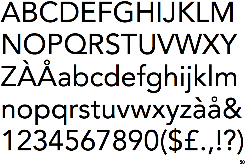
The type of project was Avenir developed by Adrian Frutiger in the 1920s. The French word avenir means the future. Jam session songs are creations of an unexpected and fluid future without planning. As a family inspired by the geometric style, the contrast between static and movement could be sharpened.
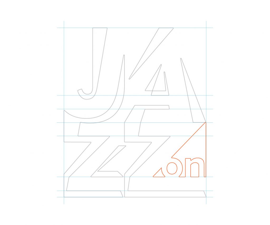
The design of the brand was based on the light beams of the stages and the mixture between the regular and italic style of the typography. Being cast, she can adapt to different backgrounds and images as well as in jazz where improvisation is a feature present.
