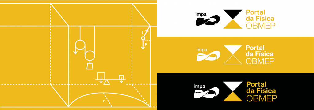
Brand Identity of OBMEP Portal
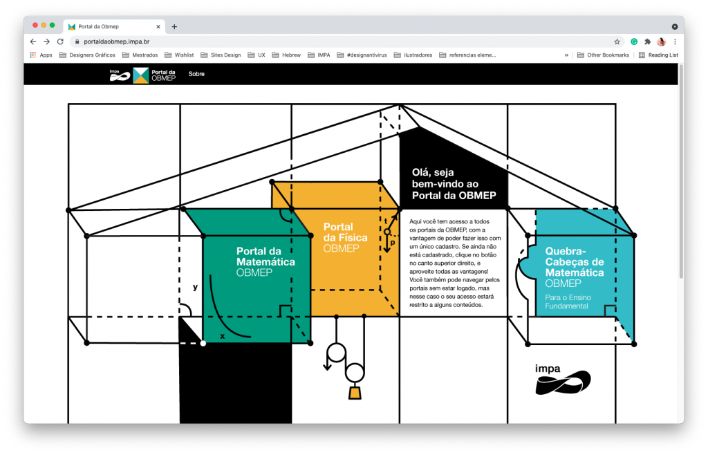
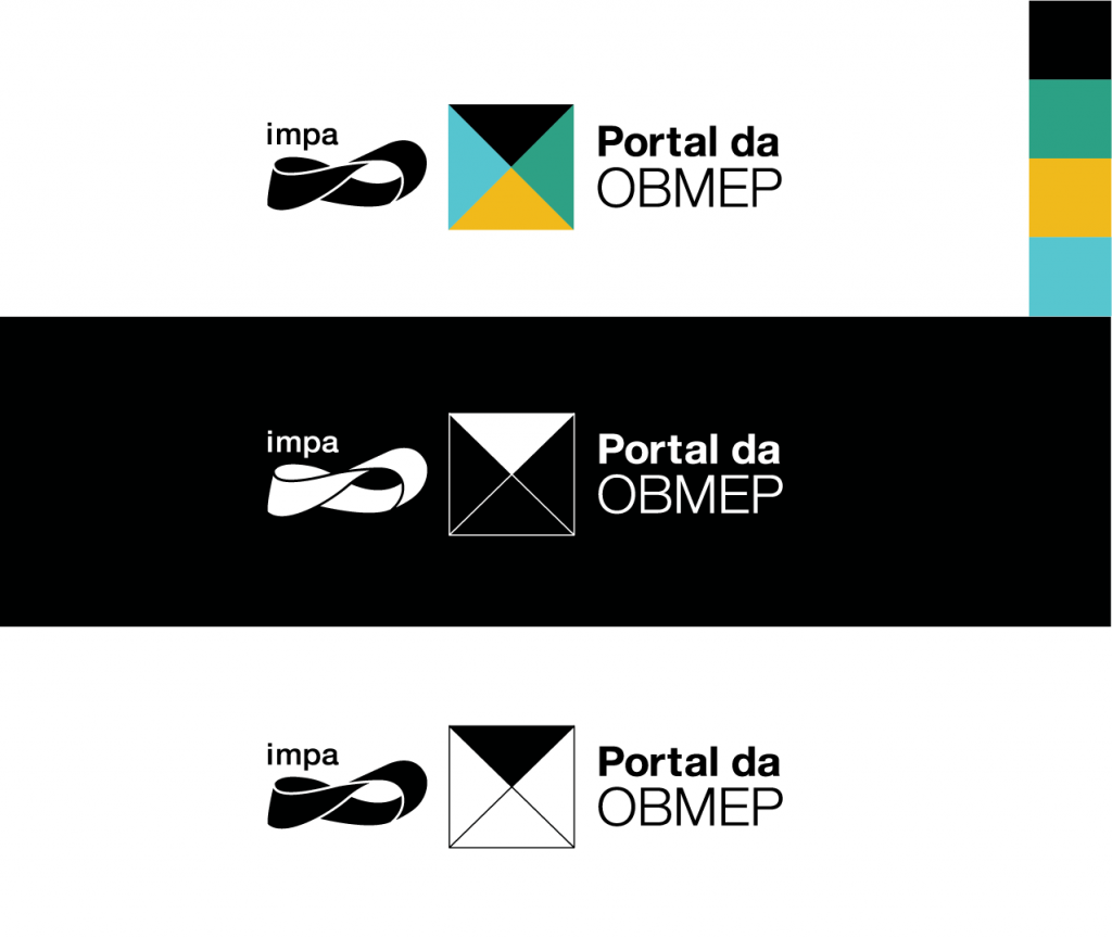
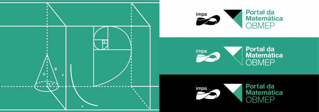
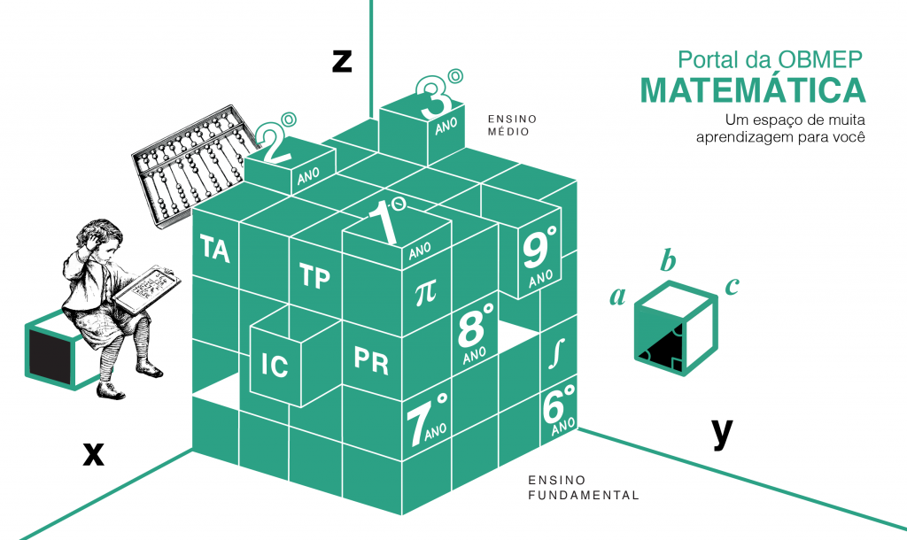
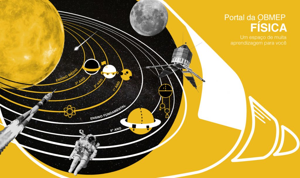
I was responsible for the visual proposal of the OBMEP Portal, a virtual space for elementary and high school students to access video classes content. The idea was to visually refer to a house formed by these three portals and, later on, the Portuguese portal will enter. Each one predominates a color of the portal’s brand, which is a paper divided into four parts and opens up a universe of elements that refer to the themes of each one.
